Ready to get started?

Book a call

PJ

Workroom Brand

  • Jul – Nov 2026
  • Product Therapy
  • Build
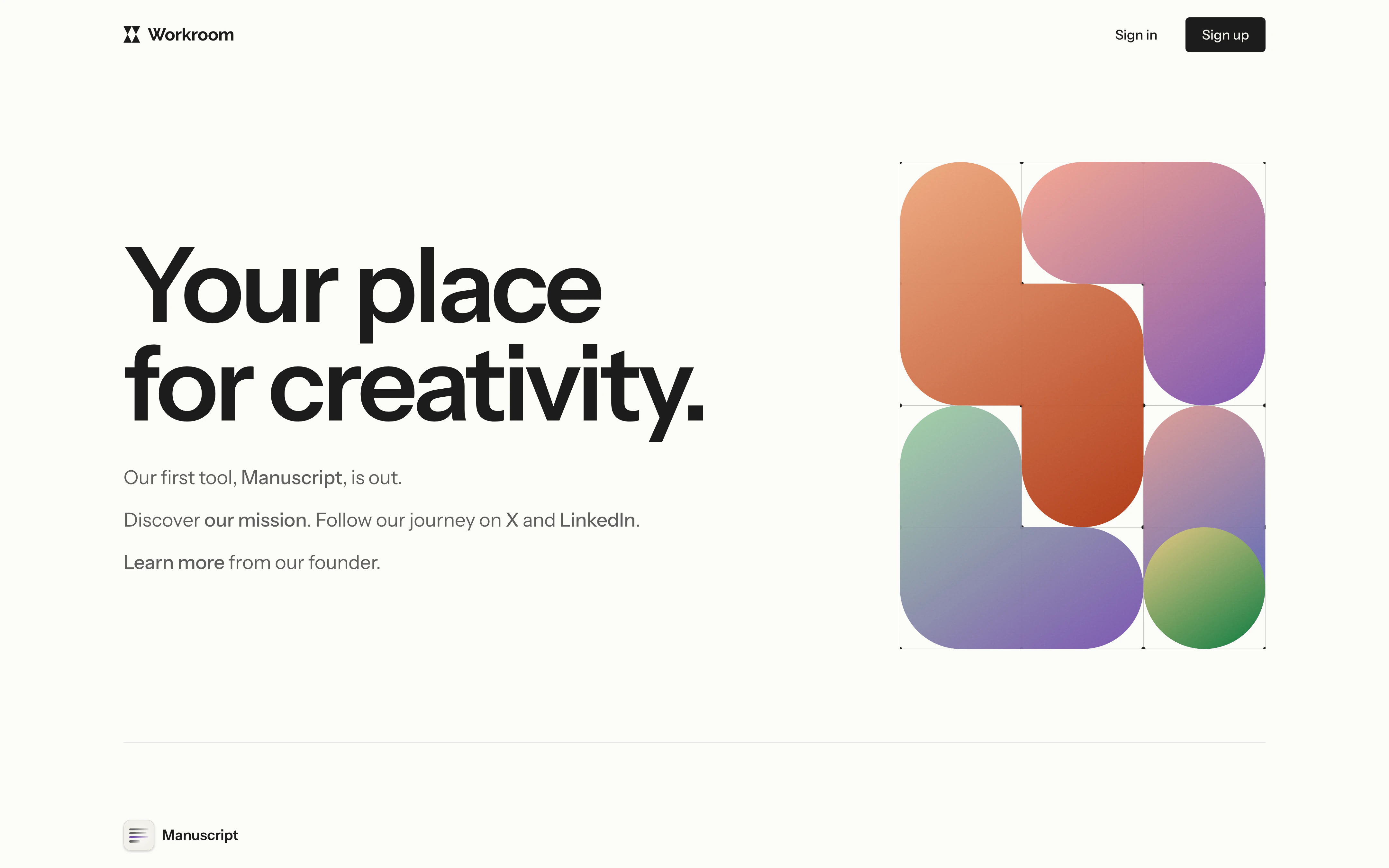
The Workroom homepage: the headline “Your place for creativity.” beside a graded pattern of rounded shapes.
The Workroom homepage at wkrm.ai is built from the brand.

Overview

Workroom Brand is the identity and design system for Workroom, our suite of tools for creative work. It covers the mark, colour, type, surfaces and controls, the app icons and the marketing site.

We worked each part from a spread of options down to one settled value, kept the options side by side in a coded sketchbook, and shipped the result into the product as design tokens.

Timeline
July – November 2026
Scope
Identity, colour, type, components, app icons and website
Tools
OKLCH colour, design tokens and Vue

The brief

Workroom needed a brand that could carry a family of tools, each with its own name and icon, and still read as one product. A first system set the idea that Workroom shows its working: precise Swiss geometry as the canvas and human marks on top of it.

The work that followed replaced that system’s palette and most of its type. What survived was Instrument Sans for the interface, Raleway for the wordmark, and the rule that a primary action is ink rather than colour.

The second pass began with a day of material studies: grids, grain, gradients, a blue pencil and geometric shapes. Grain stayed, and became part of the icons and the pattern.

The mark

The first mark, cut for the browser tab, was a white W on black. We redrew it as four triangles in a square, two pointing down over two pointing up. We tried the fourth triangle as an open V, in colour and as an inverse, then went back to the plain triangles.

The new mark replaced the W in the browser tab when the brand shipped. The wordmark is set in Raleway with the mark at cap height.

A white W on a black square beside the new mark: four black triangles in a rounded white square.
The first mark was a white W on black.
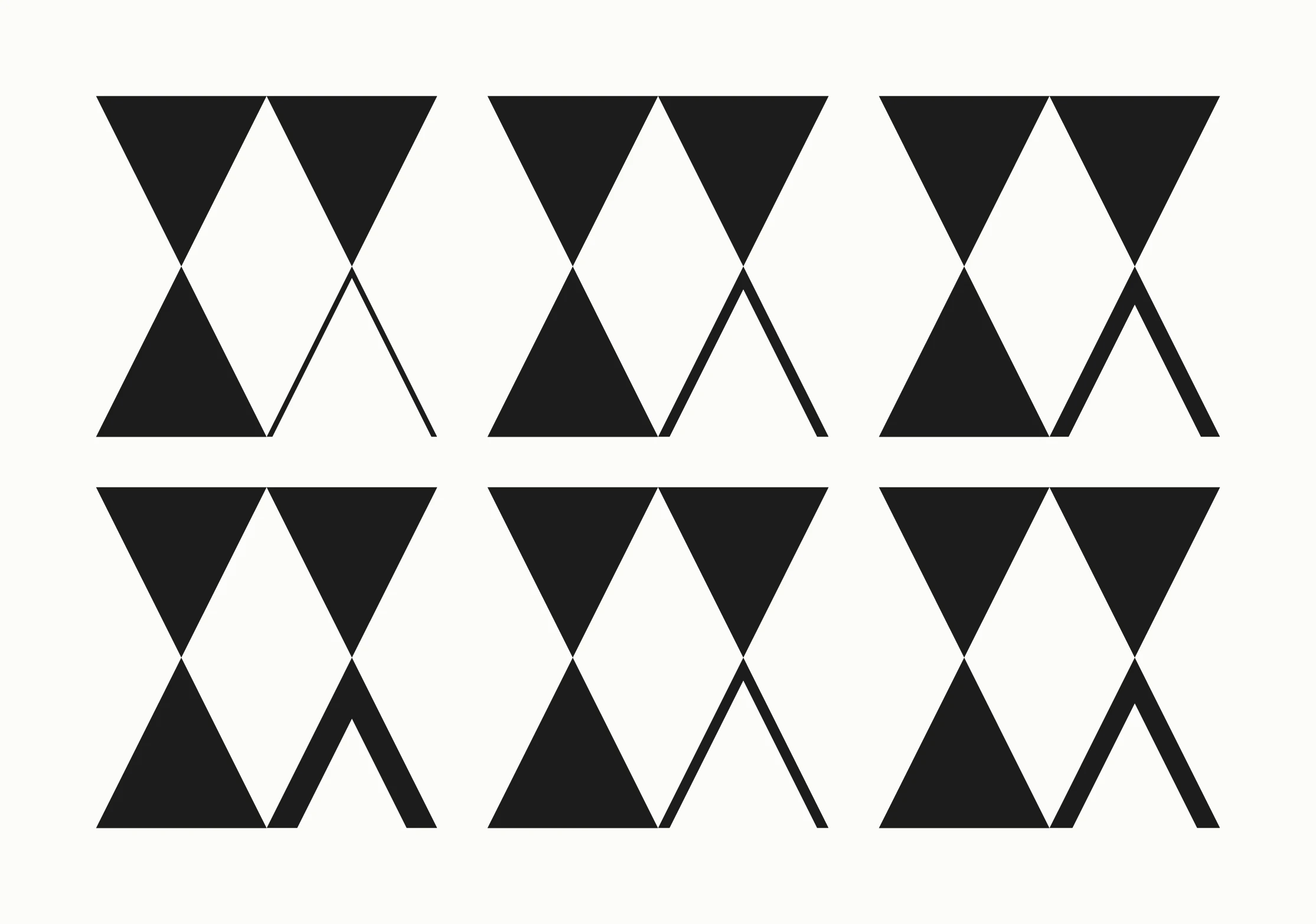
Rows of the four-triangle mark with the fourth triangle drawn as an open V in different strokes.
The fourth triangle was tried as an open V.
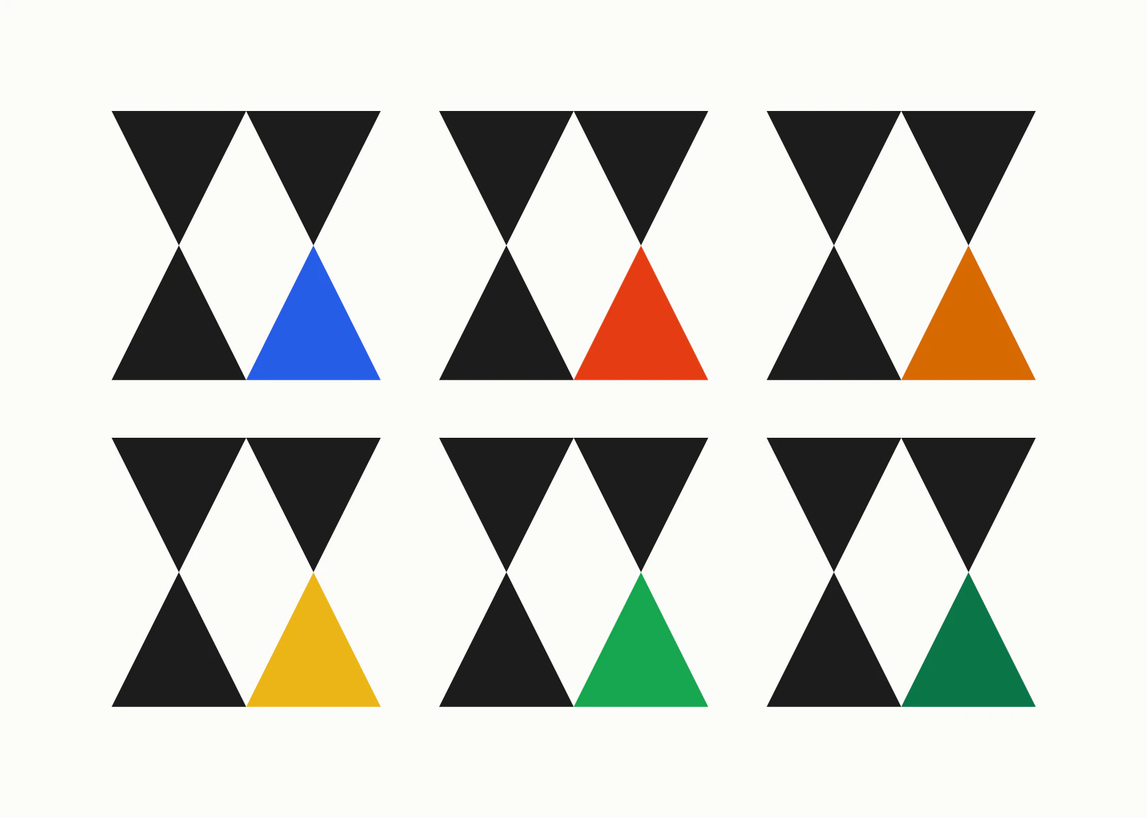
The mark with its fourth triangle filled in cobalt, vermilion, orange, yellow, green, deep green and purple.
It was also tried as a single triangle in colour.
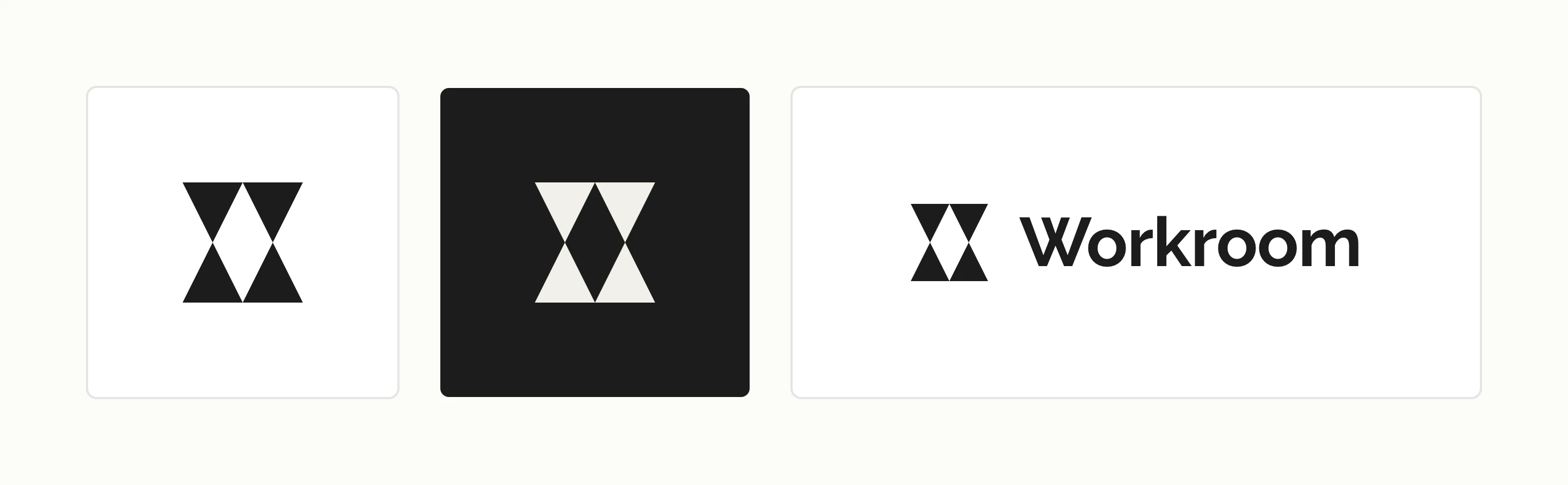
The Workroom mark on a light tile and on a dark tile, beside the lockup of the mark and the wordmark.
The settled mark is ink on light and cream on dark, and it locks up with the wordmark in Raleway.

Colour

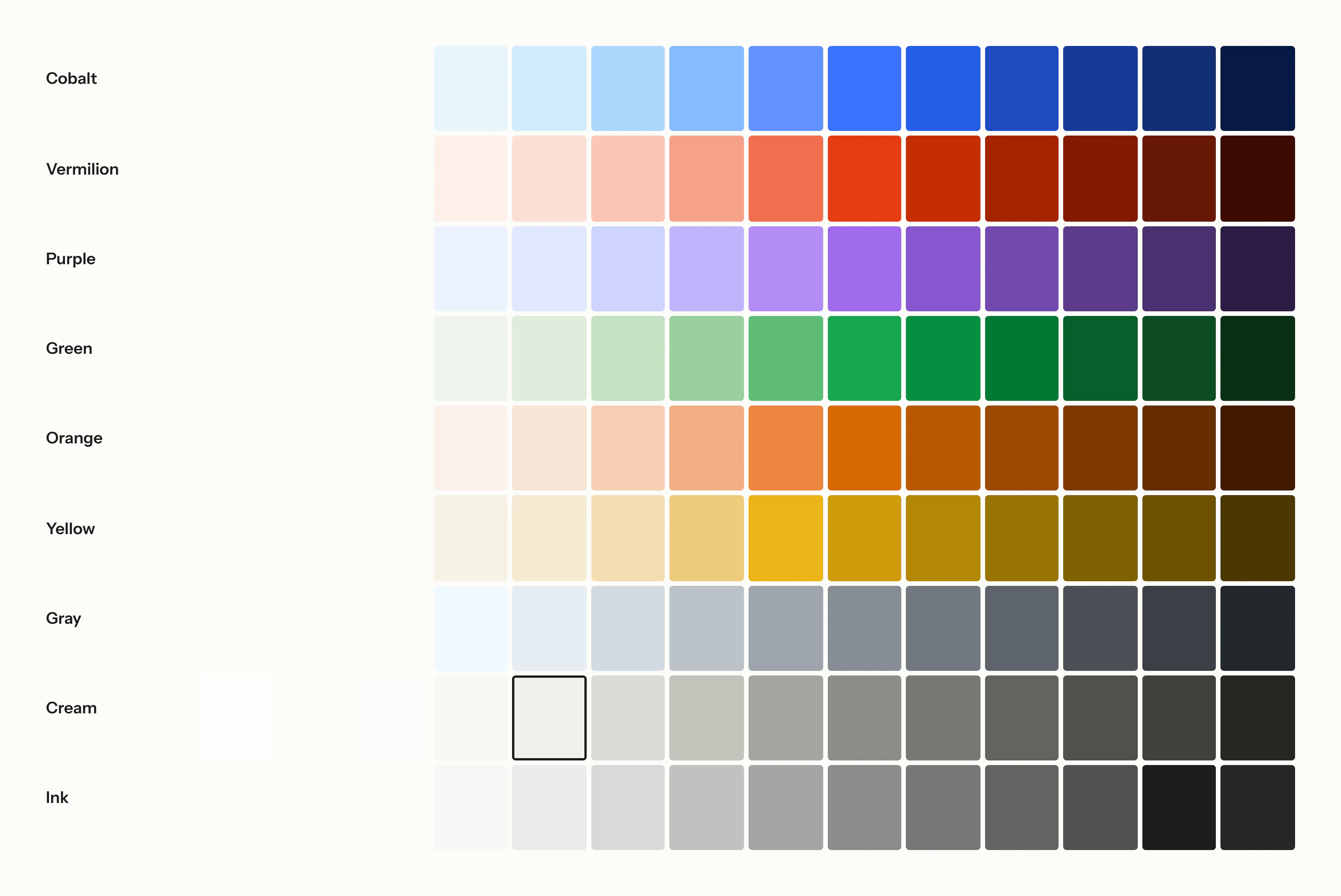
The new palette started from clay: terracotta, ochre, stoneware, kaolin and raku. A day later it gave way to ramps built in OKLCH, so the steps look evenly spaced across every hue. We tried more hues than the brand would keep and settled on cobalt, vermilion, purple, green, orange and yellow, with gray, cream and ink as neutrals.

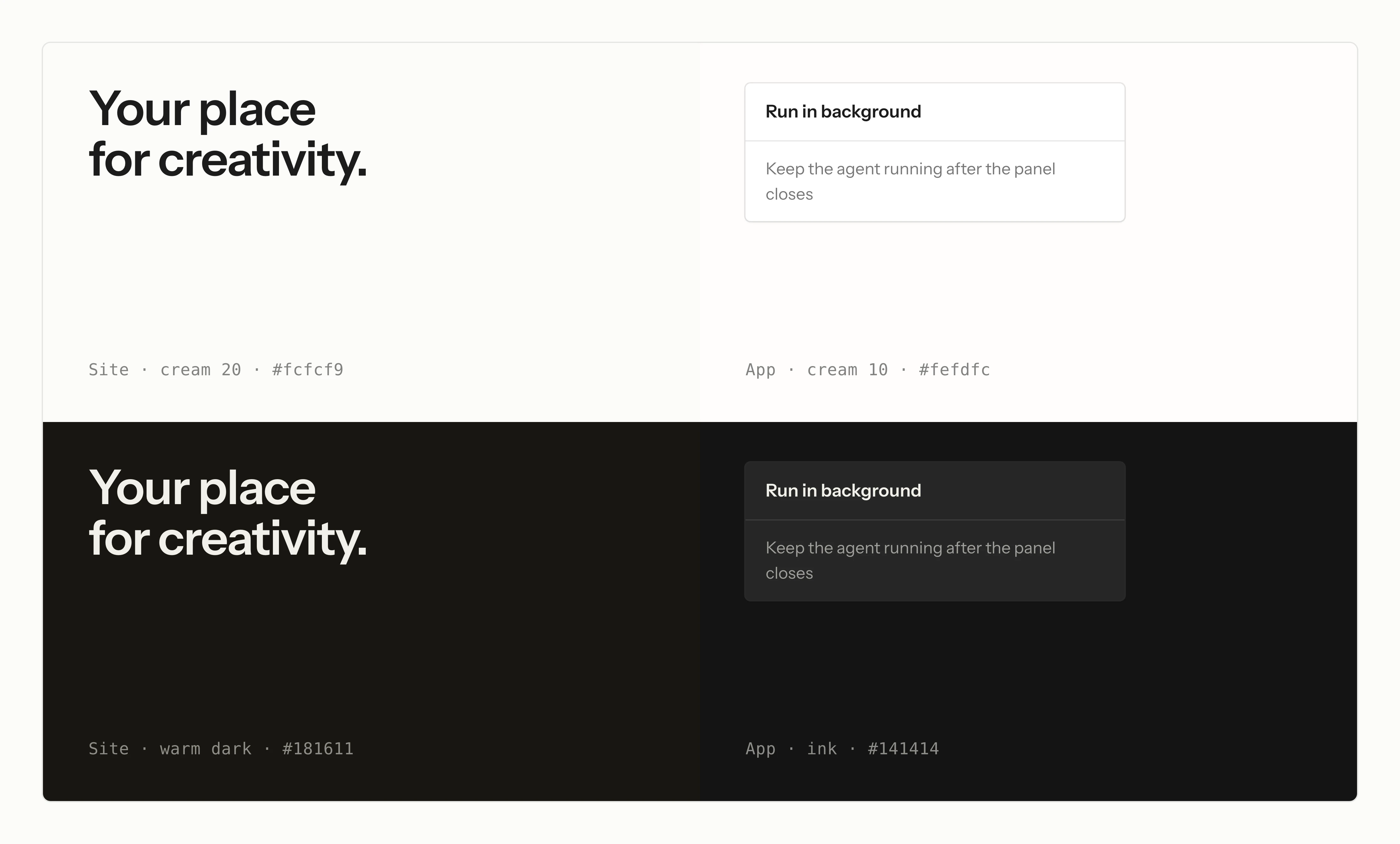
The site and the app sit on different creams. The site’s ground is the warmer one, so a page reads as paper. The app’s is closer to white, and inside its white panes the steps are drawn in ink, because cream turns yellow beside white.

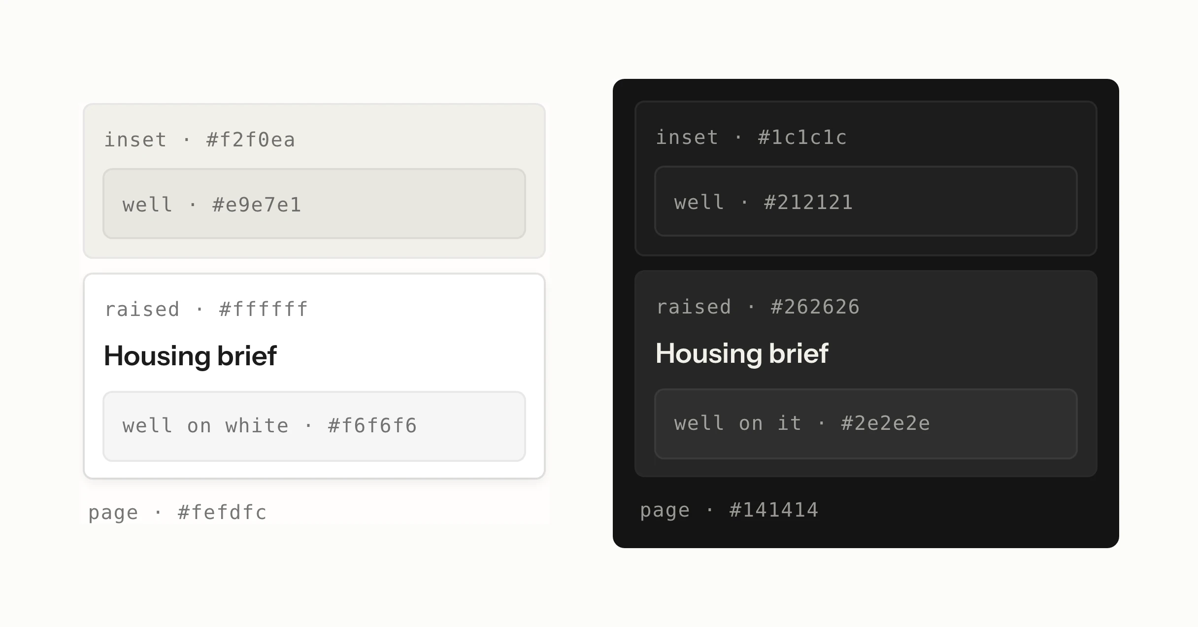
Dark mode is not an inversion: the same ladder of grounds is rebuilt on ink, and each dark pair is measured to keep the contrast of its light pair. It keeps the two grounds apart too: the site’s dark is warm, its paper in shadow, and the app’s is a neutral ink.
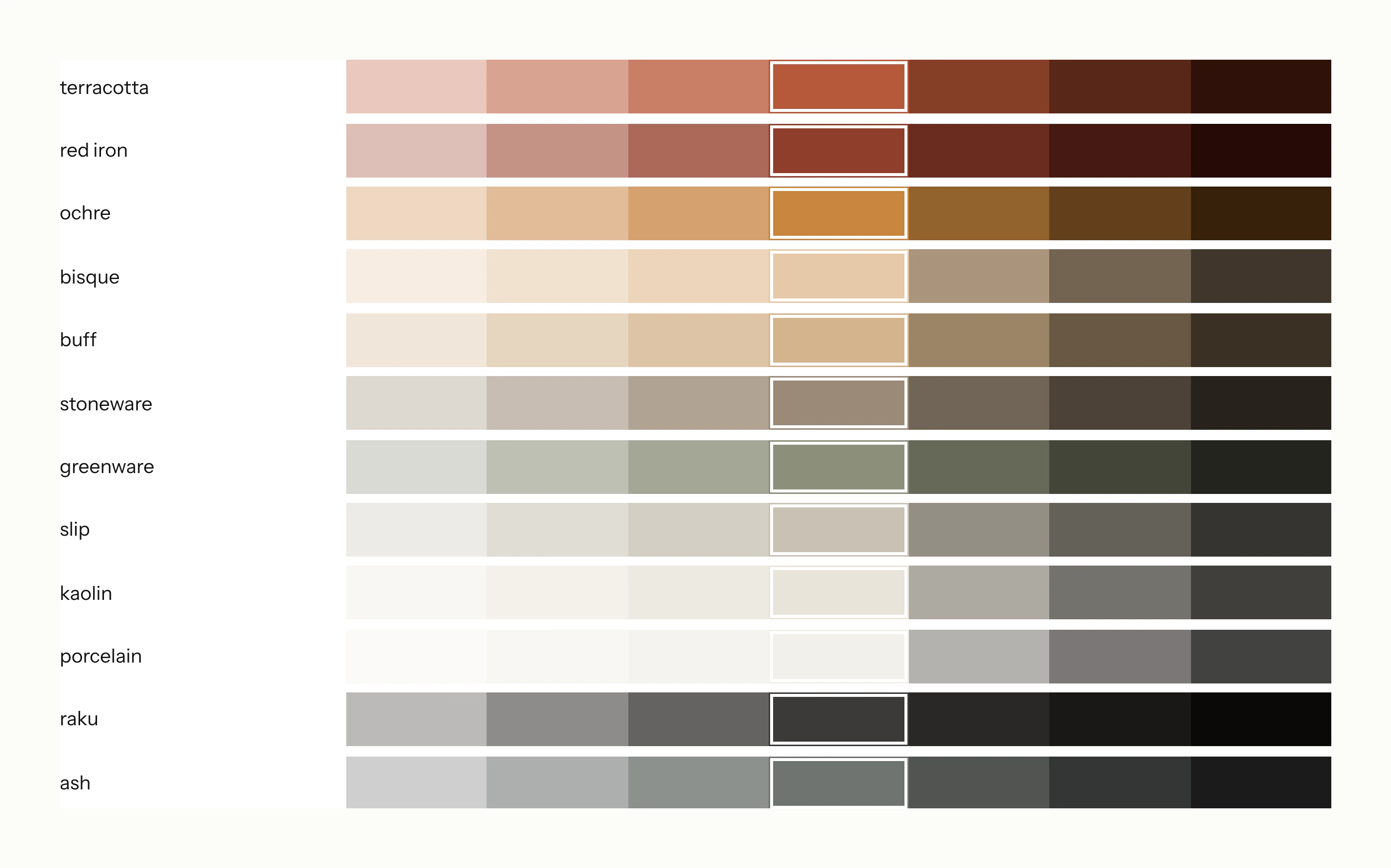
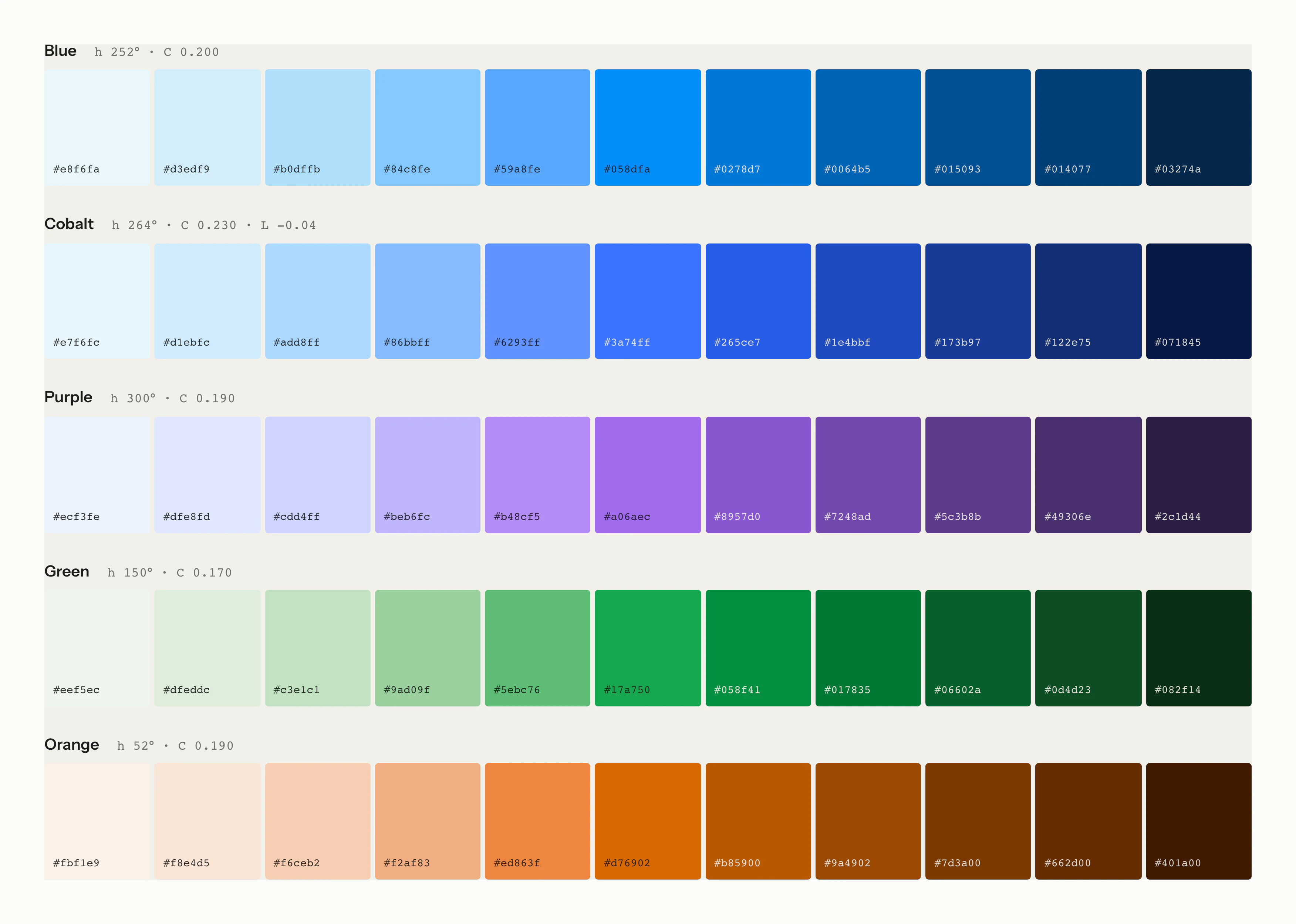
Ramps of clay colours from light to dark: terracotta, red iron, ochre, bisque, buff, stoneware, greenware, slip, kaolin, porcelain, raku and ash.
The new palette was first drawn from clay, from terracotta to raku.
Even ramps from light to dark in blue, cobalt, purple, green and orange.
A day later the palette became even ramps built in OKLCH, with more hues than the brand would keep.
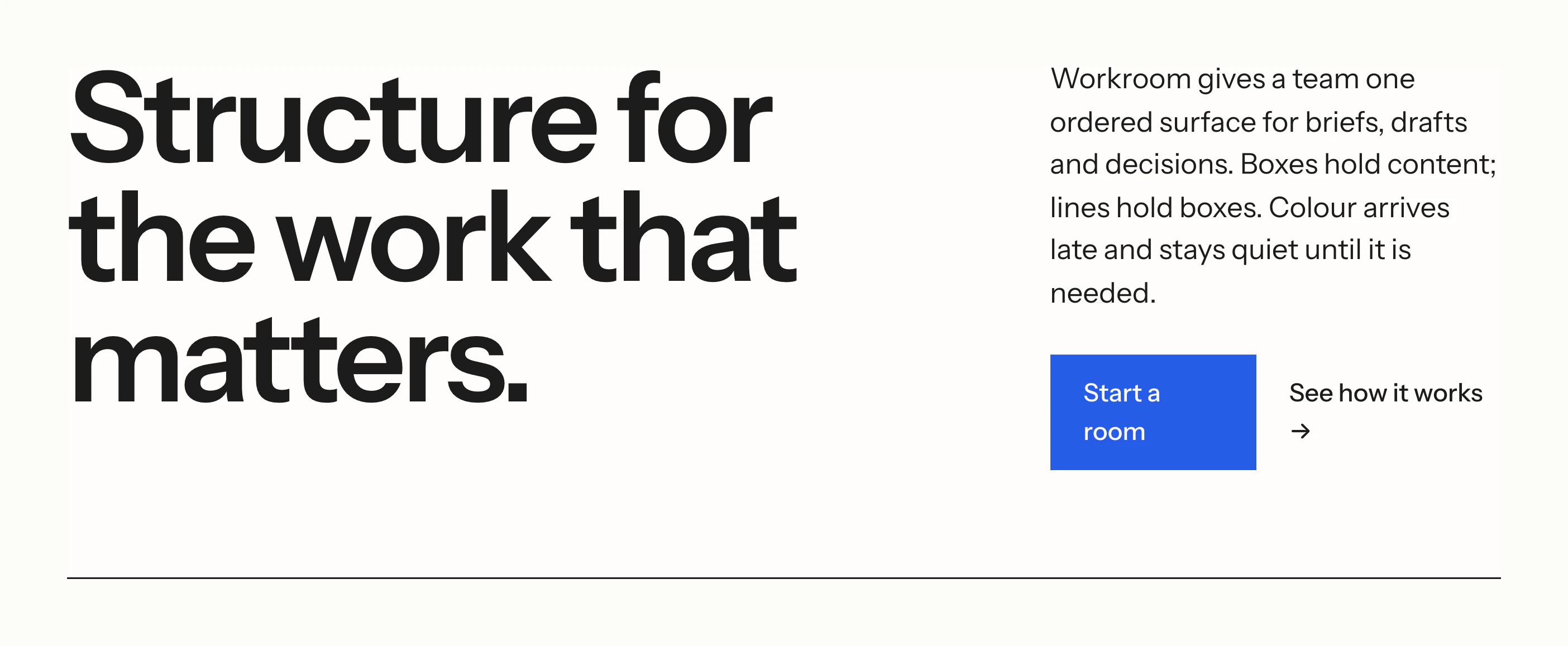
An early homepage with the headline “Structure for the work that matters.” in ink on cream and a single cobalt button.
An early homepage study adds one accent to a page that is otherwise ink on cream.
The settled ramps for cobalt, vermilion, purple, green, orange, yellow, gray, cream and ink.
The settled palette pairs cobalt, vermilion, purple, green, orange and yellow with gray, cream and ink.
Four panels: the site’s cream ground and the app’s whiter ground with a white panel on it, above the site’s warm dark ground and the app’s neutral ink ground.
The site sits on a warmer cream than the app, and keeps that warmth in the dark.
The light ladder of page, inset card, well and raised card beside the same ladder rebuilt on ink.
Dark mode rebuilds the same ladder on ink, with each step measured against its light pair.

Type

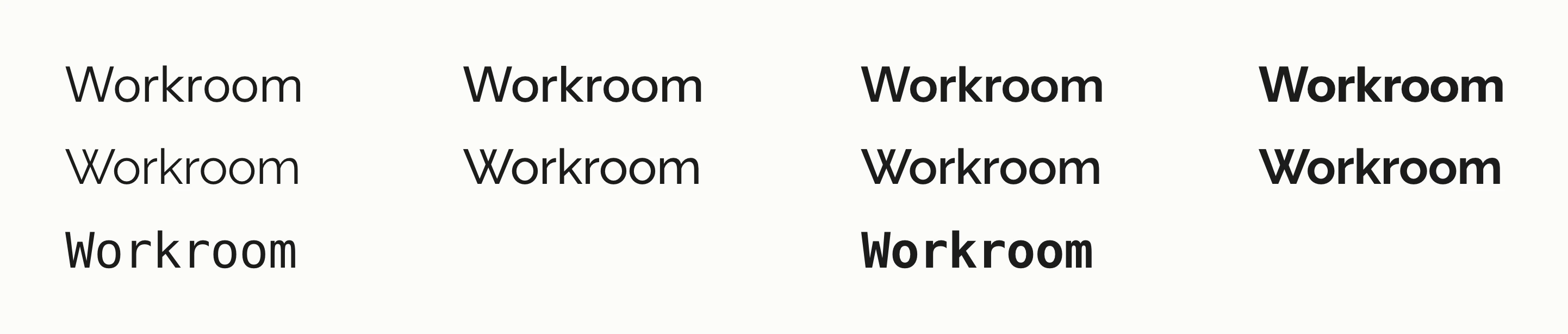
We set Instrument Sans and Raleway along the same type scale. Instrument Sans took the interface and the headlines, and Raleway was kept for the wordmark alone.

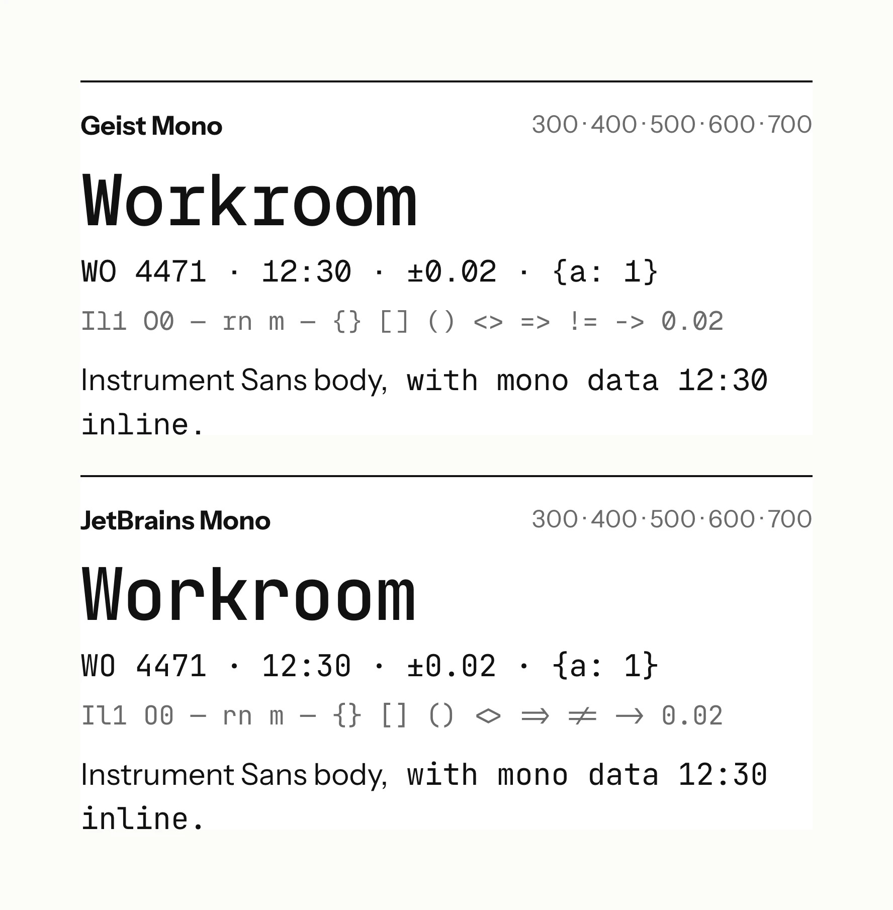
Instrument Sans has no monospace, so the next day we set candidates side by side on the same sample and read each one in real code. Bitstream Vera Sans Mono was chosen for code and numerals.
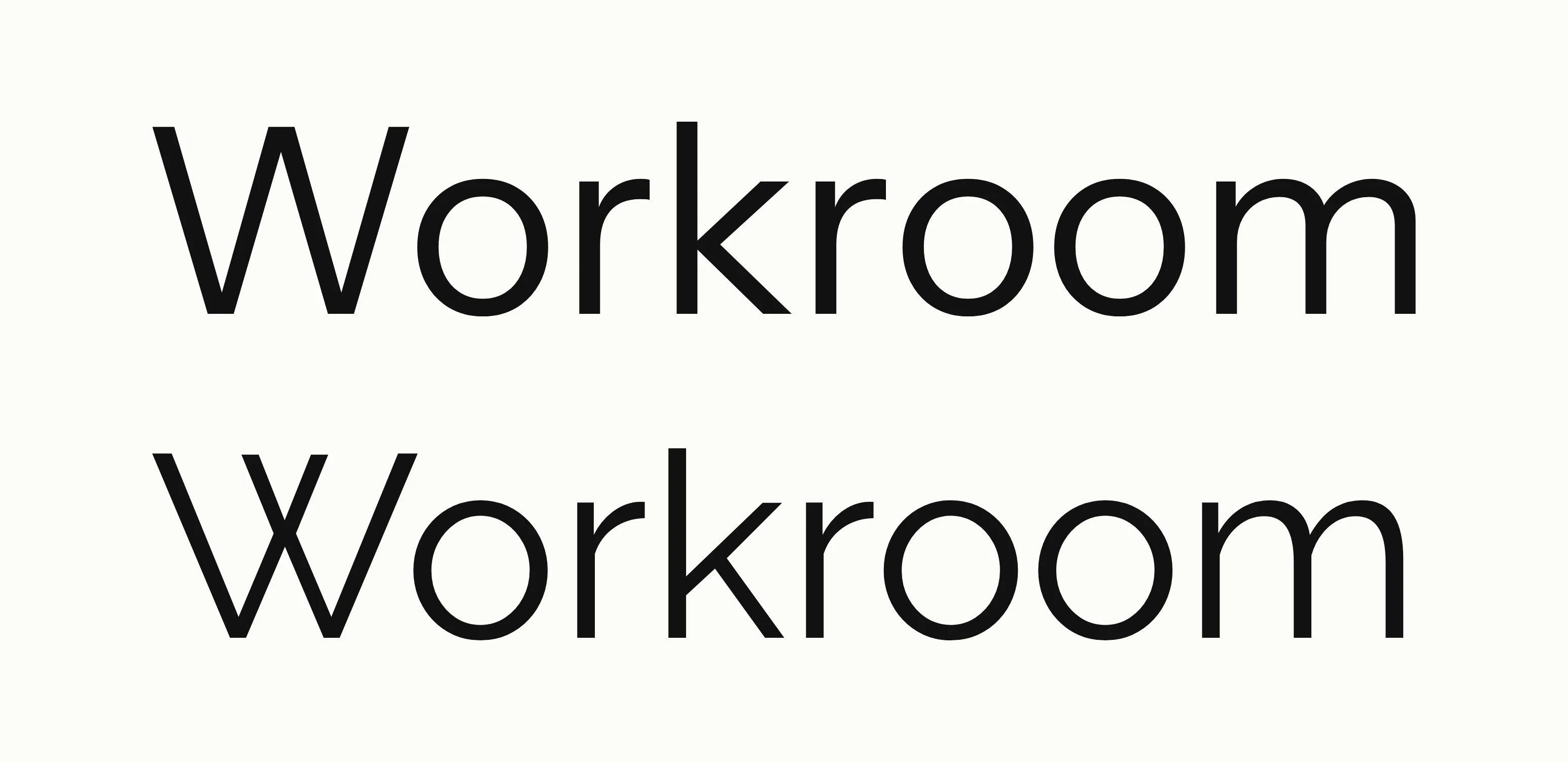
The word Workroom set large in Instrument Sans, above, and in Raleway, below.
Instrument Sans, above, and Raleway were set on the same scale.
Geist Mono and JetBrains Mono set on the same sample, beside Instrument Sans body text.
Candidates for the monospace were set on the same sample, beside Instrument Sans body text.
The word Workroom in Instrument Sans and in Raleway at four weights each, and in Bitstream Vera Sans Mono at two.
Instrument Sans sets the interface, Raleway the wordmark, and Bitstream Vera Sans Mono the code and numerals.

Surfaces and depth

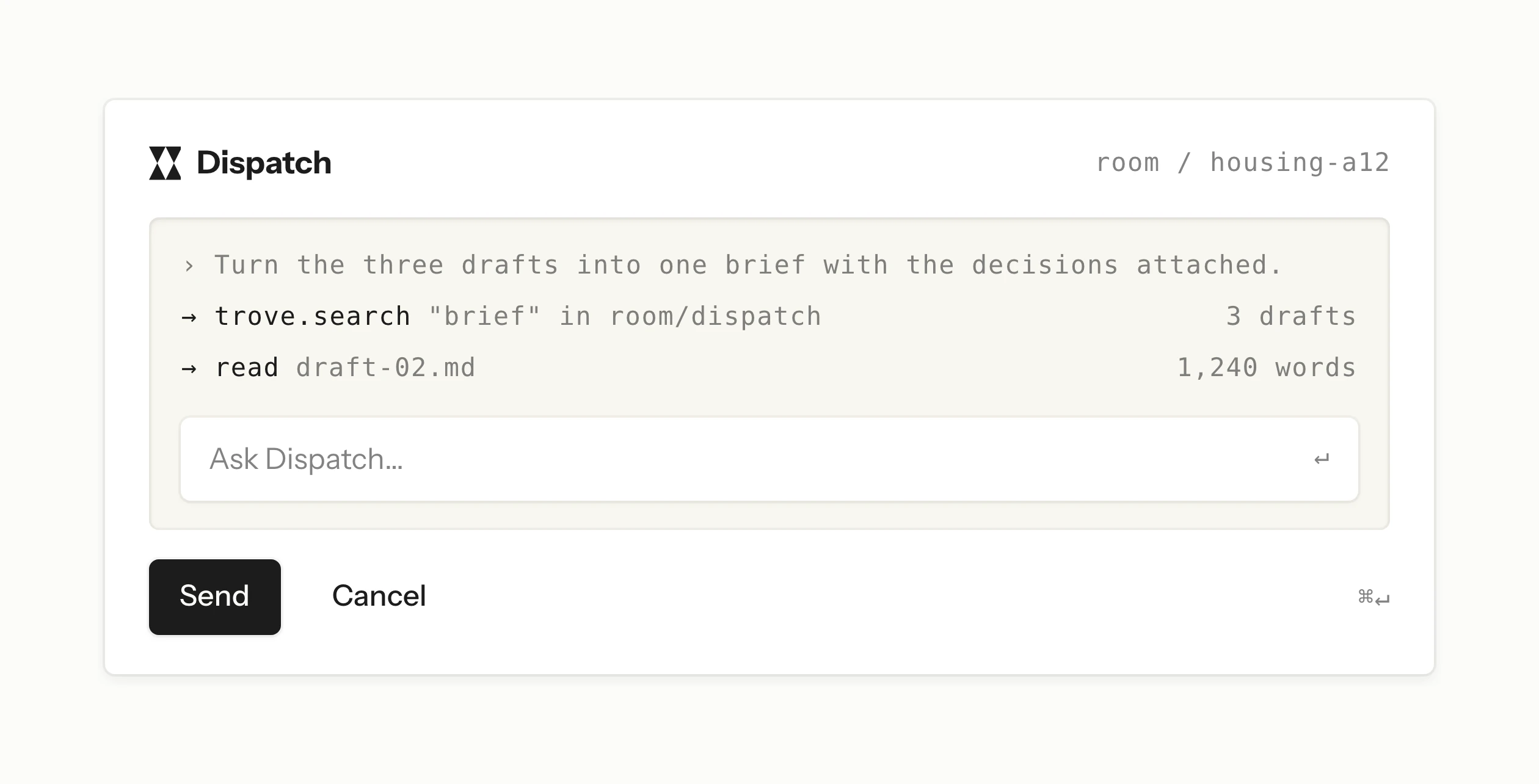
Depth comes from tint before shadow. We tried raised cards at several strengths of shadow, and inset cards, on several cream grounds. The next day we took the lightest lift apart to see what the shadow and the keyline each add, and settled a ladder: the page, an inset card and a well each step darker, and anything you act on is white with a small lift. A modal is the same raised surface over a scrim, so it needs no bigger shadow.
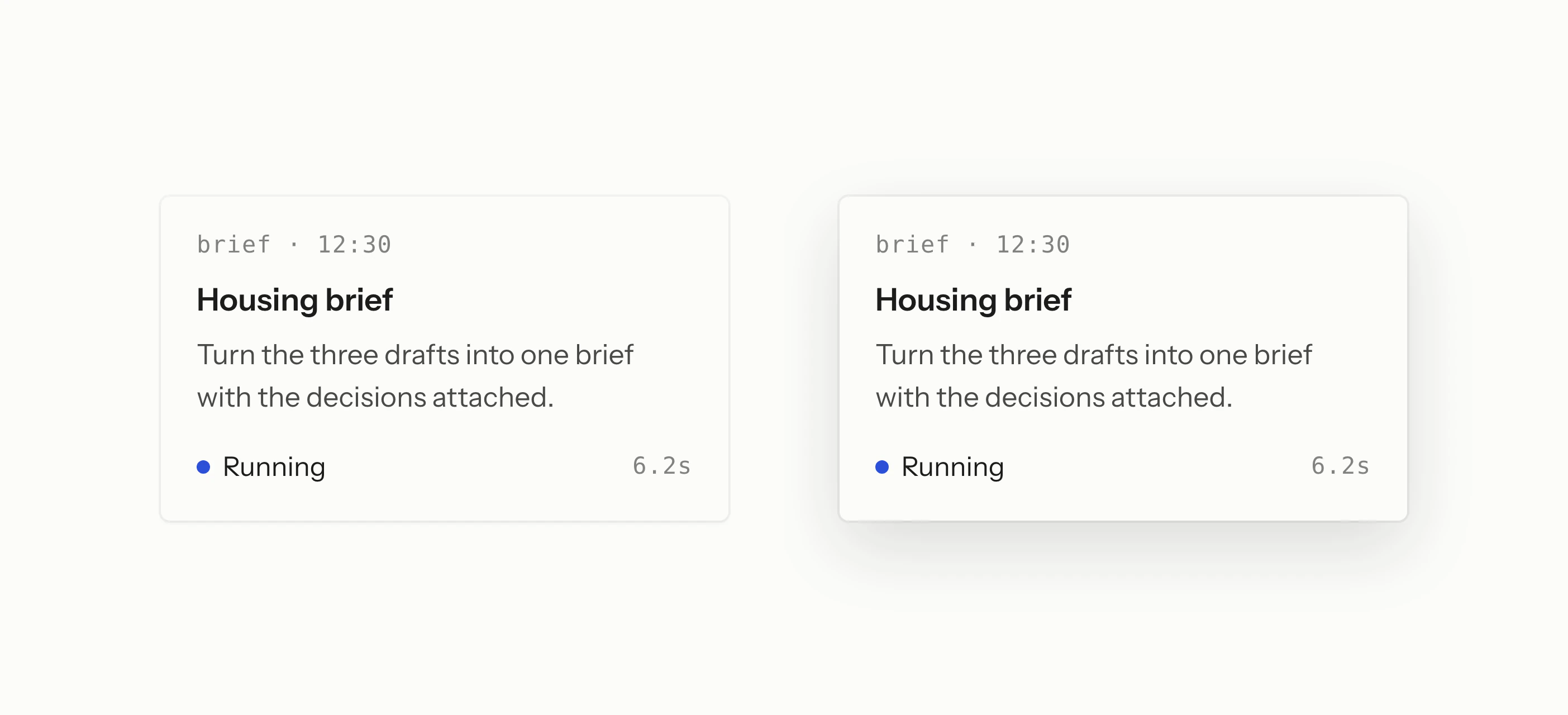
The same brief card twice on a cream ground, lifted lightly on the left and floating on a deeper shadow on the right.
Raised cards were tried from the lightest lift to a floating shadow.
A Dispatch panel with an inset well of commands and a white field reading “Ask Dispatch…” above Send and Cancel buttons.
An early panel held an inset well, and the well held a white field.
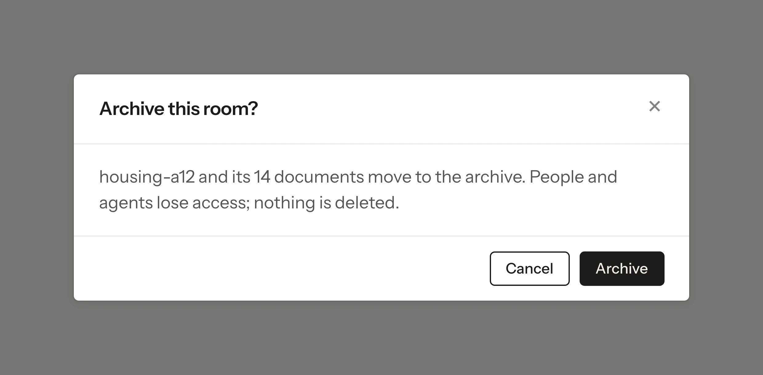
A white dialog titled “Archive this room?” with Cancel and Archive buttons, over a grey scrim.
A modal is the same raised white surface, set over a scrim instead of a bigger shadow.
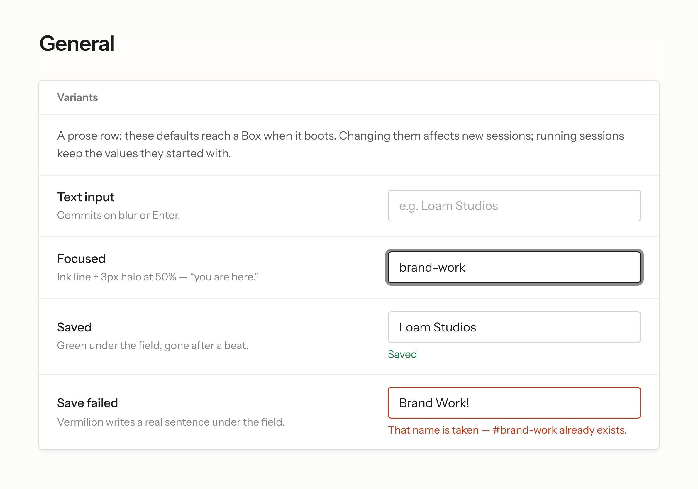
A raised settings panel titled General, with text fields at rest, focused, saved and in error.
A settings form sits on one raised panel, with every field state in place.
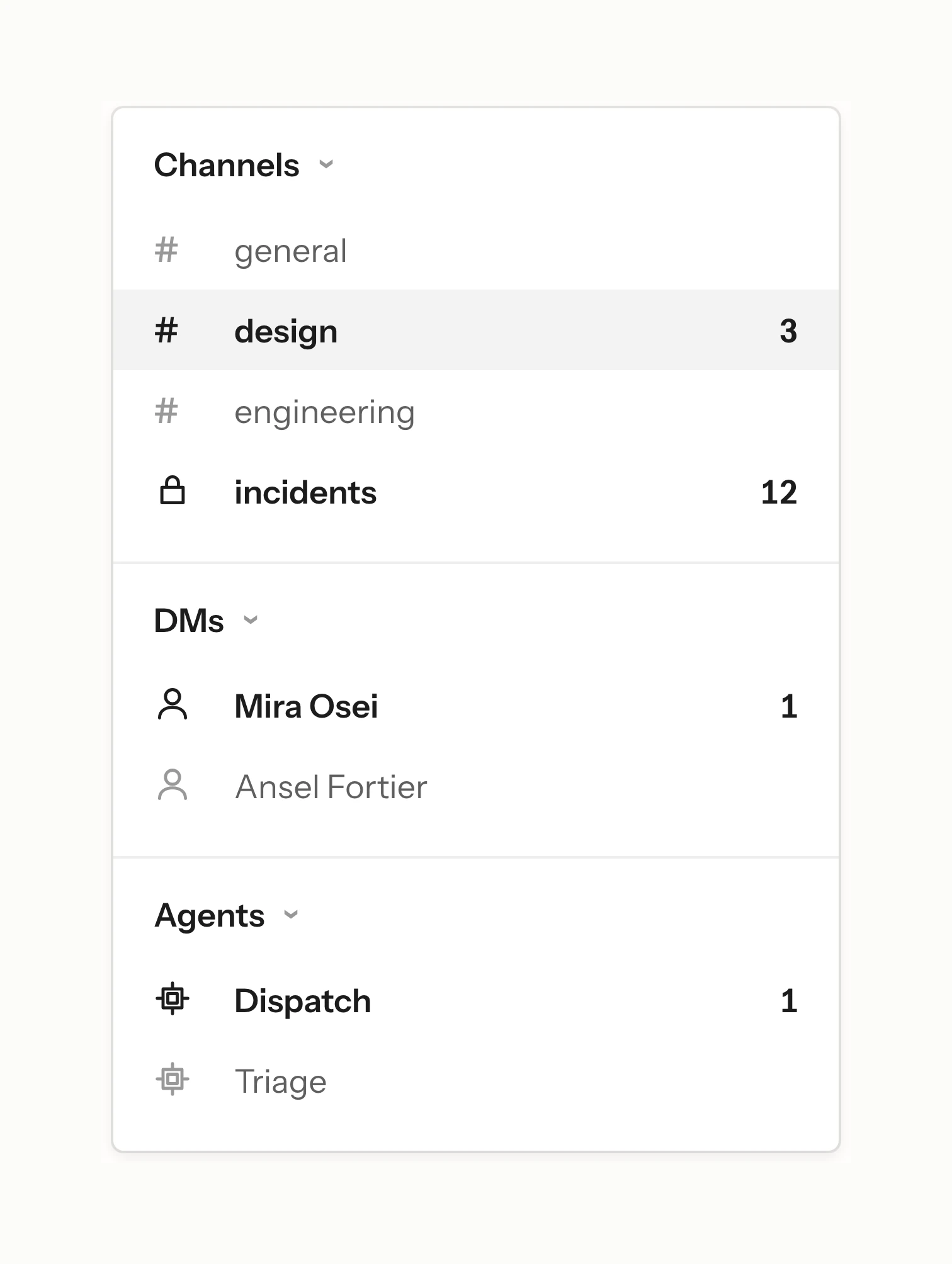
A raised menu with groups for channels, direct messages and agents, one row selected and unread counts at the right.
A menu is the same raised panel, with rows grouped under quiet heads.

Edges and controls

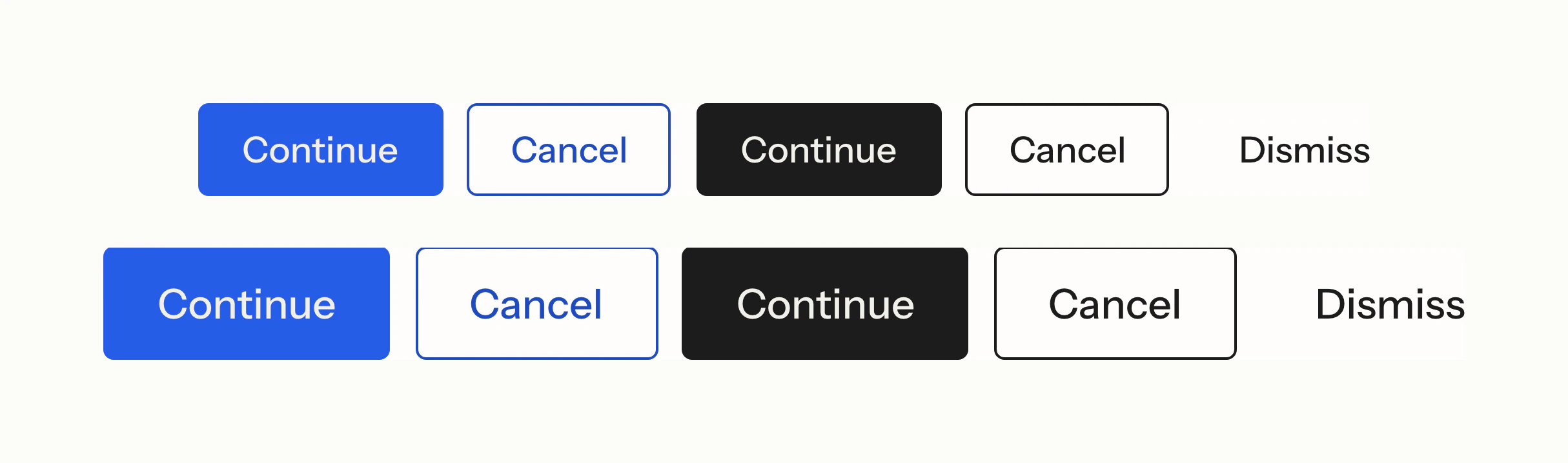
Corners were tested on the first day, from square to pill, with a button nested inside a box to see how inner and outer corners meet. Buttons settled at a small, fixed radius as solid, outline and ghost, with ink for the primary action.

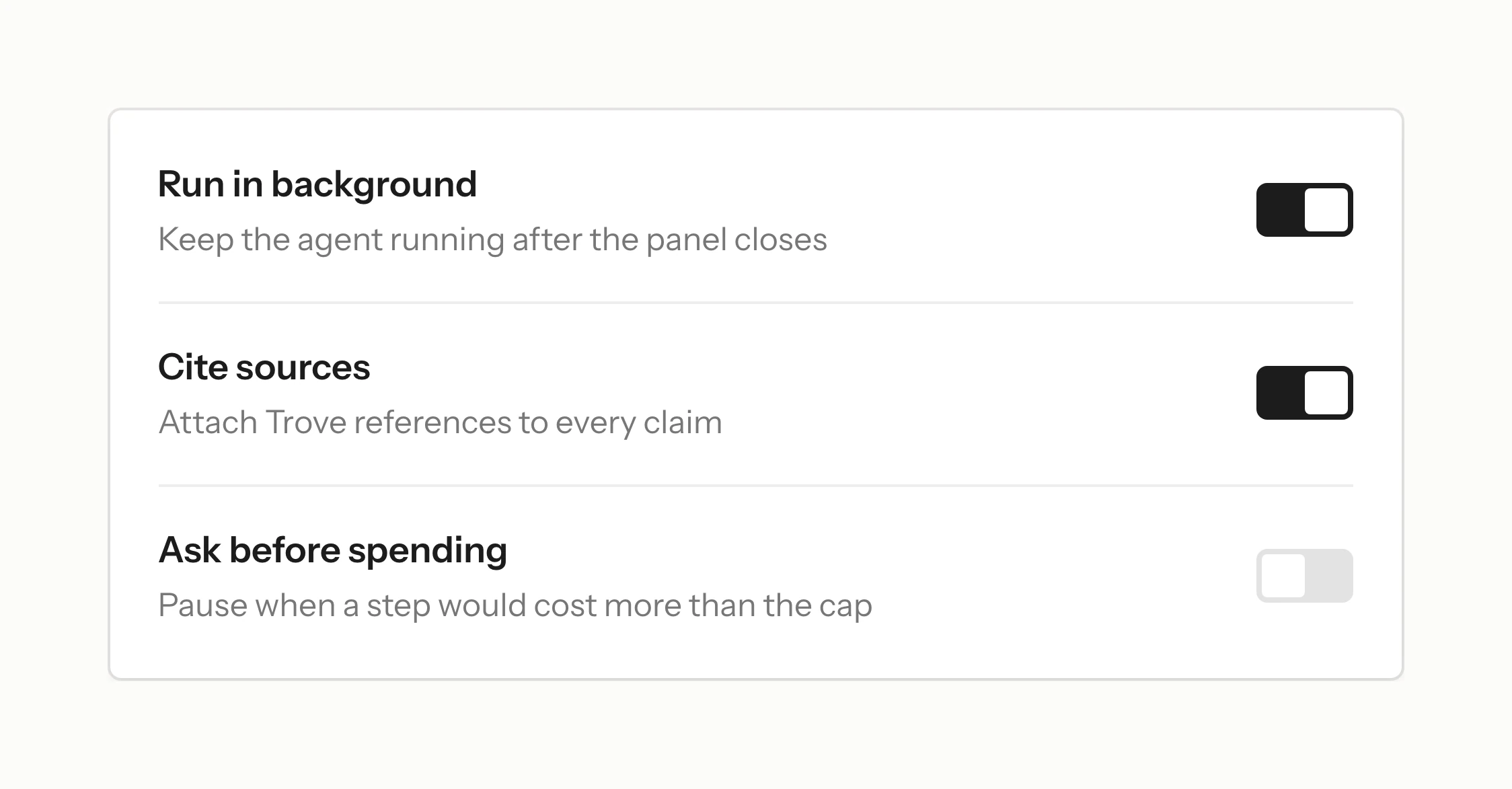
The switch was built from the same rules. It was tried with several off states and corner shapes, and settled as a small track with a white sliding knob. Motion is stated once for every control: a press is instant, a change of state eases out quickly, and some things never animate.
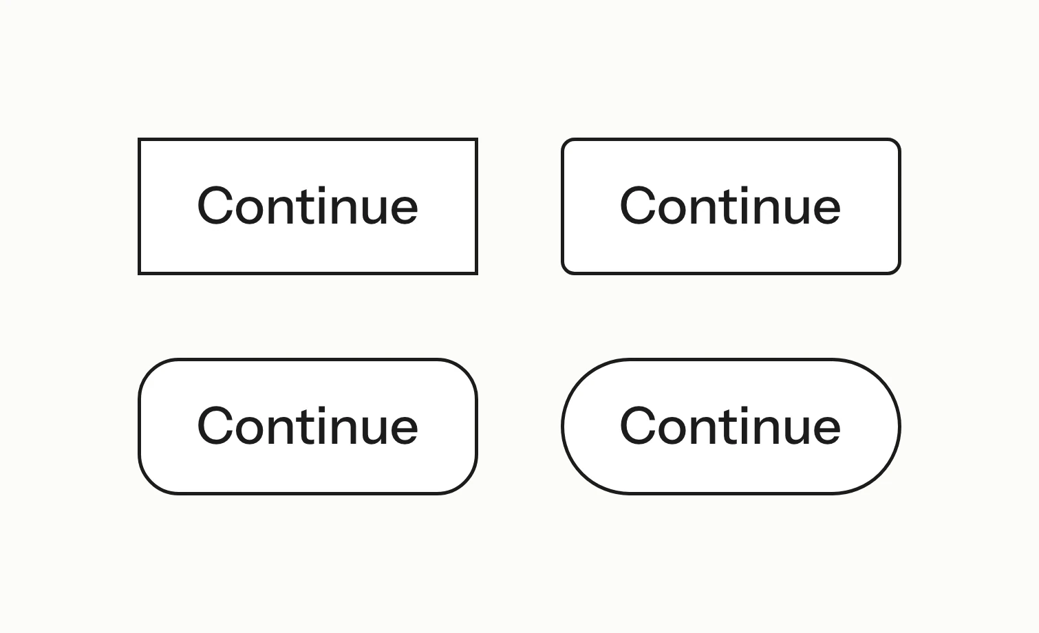
Four outline Continue buttons, from square corners to fully round.
Corner radius was tested from square to pill on the same button.
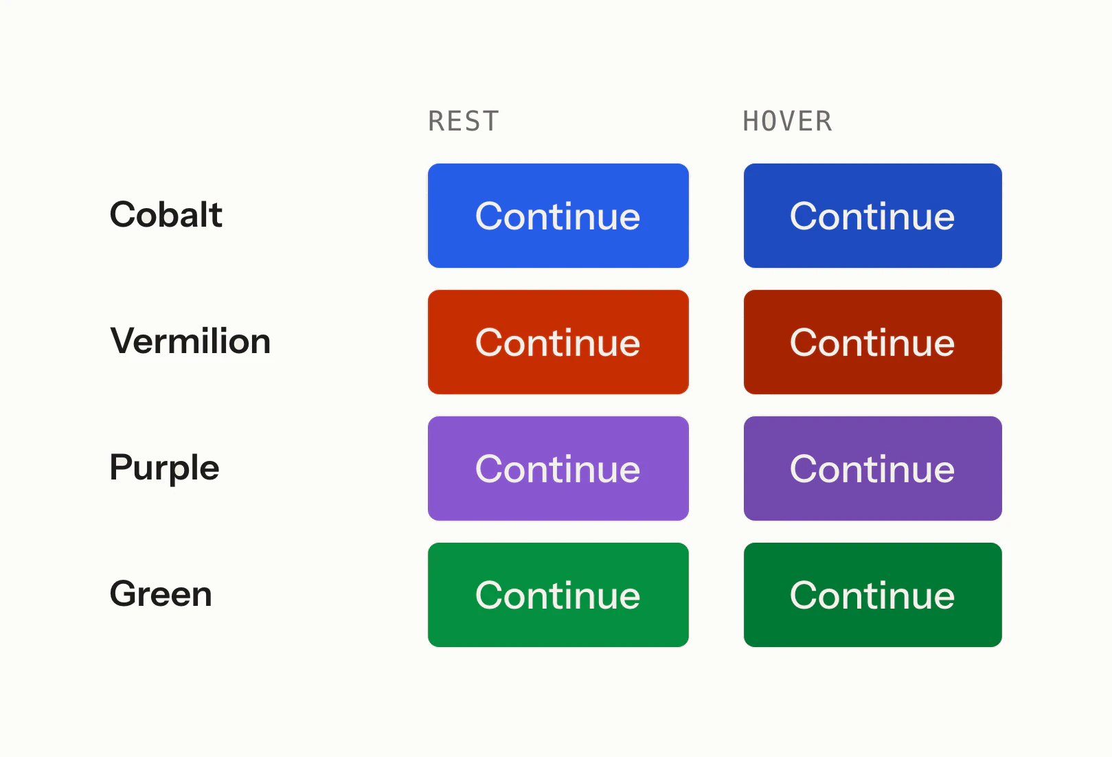
Solid Continue buttons in cobalt, vermilion, purple and green, at rest and on hover.
Every accent was drawn as a solid button in each state.
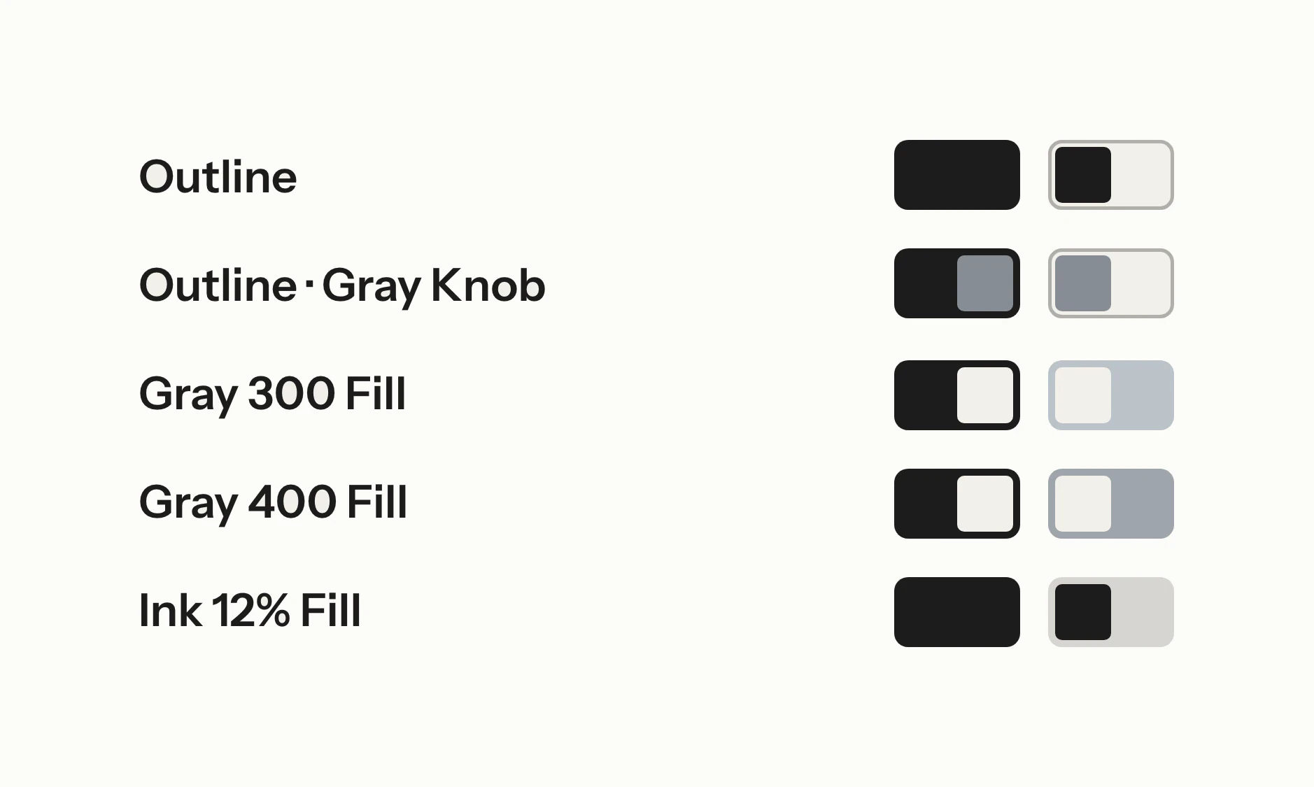
Switch studies in ink with outline, grey and tinted off states.
The switch was tried with several off states and corner shapes.
A raised settings panel with three rows, each with a label, a description and a switch.
The settled switch sits in a raised settings panel.
The settled buttons at two sizes: solid cobalt, outline, solid ink, outline ink and a ghost Dismiss.
The settled buttons come in solid, outline and ghost.
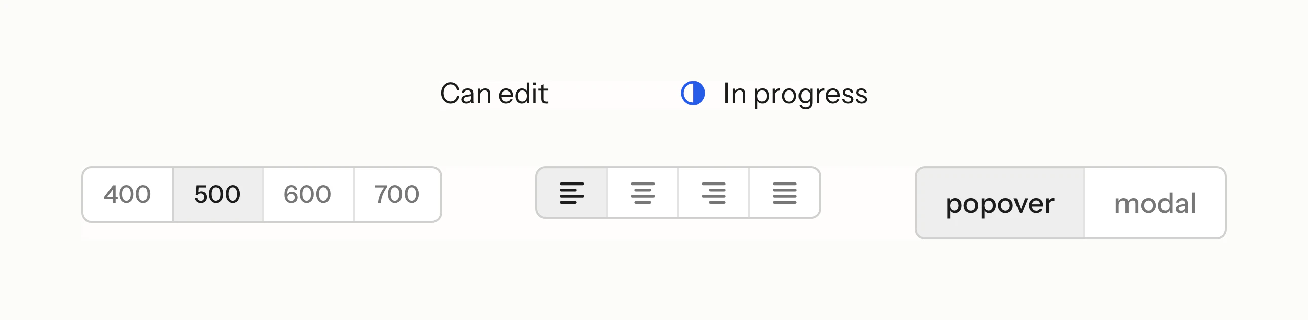
A select reading “Can edit” and another with a status icon, above segmented controls for weight, alignment and popover or modal.
Selects and segmented controls follow the same quiet rules.

App icons

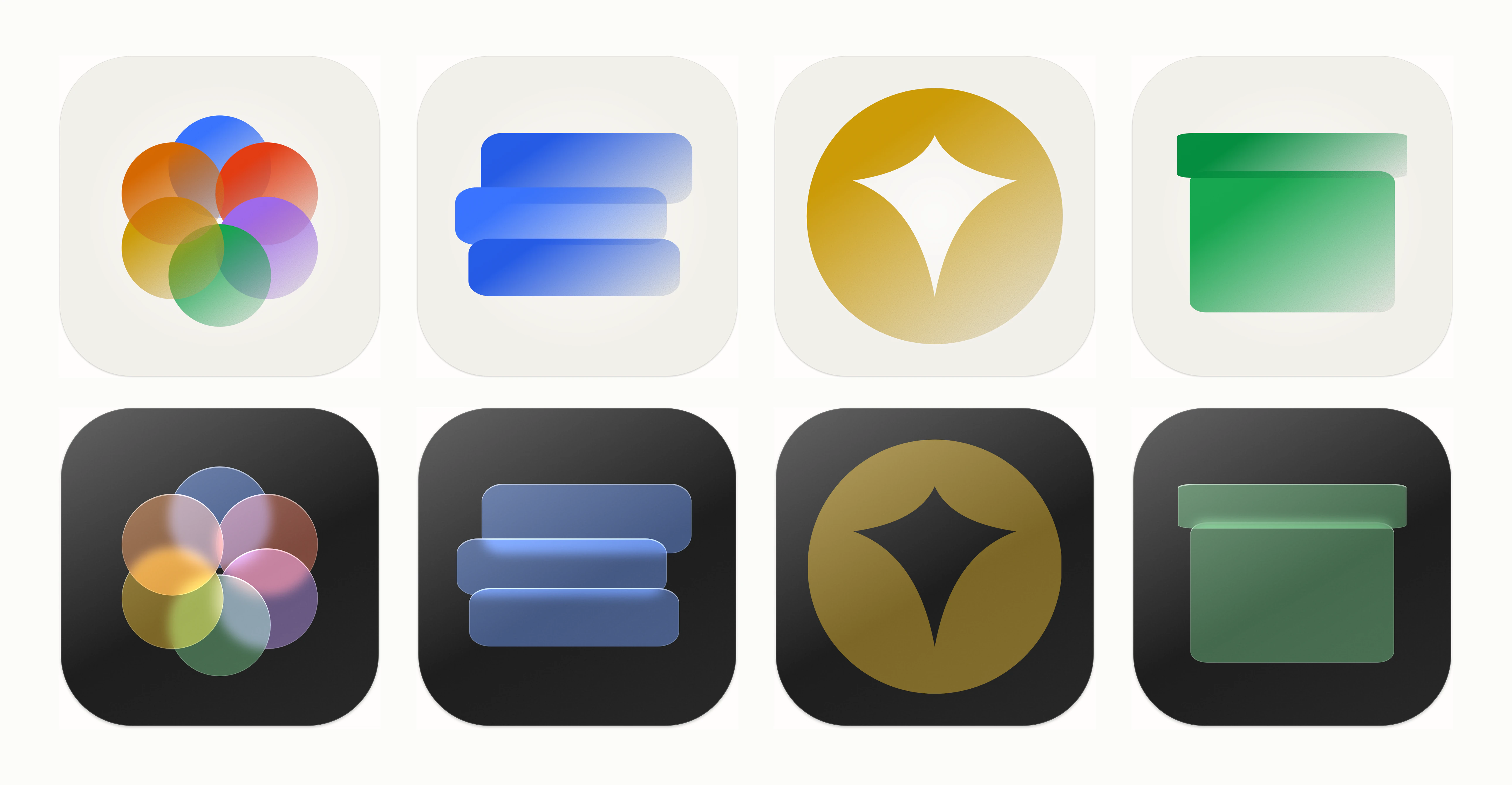
The icons began as glass: Circle’s discs on ink and Dispatch’s bars on a cobalt tile. A sampler then tried different textures on the same discs. Circle was locked first, in a graded treatment: hard edges, the colour fading along the shape to the paper, and grain in the fade.

Its recipe set the pattern for Dispatch, Artefact and Trove, and Trove was later recut as a coin. Glass survived only as the dark-mode version of each icon, on ink.
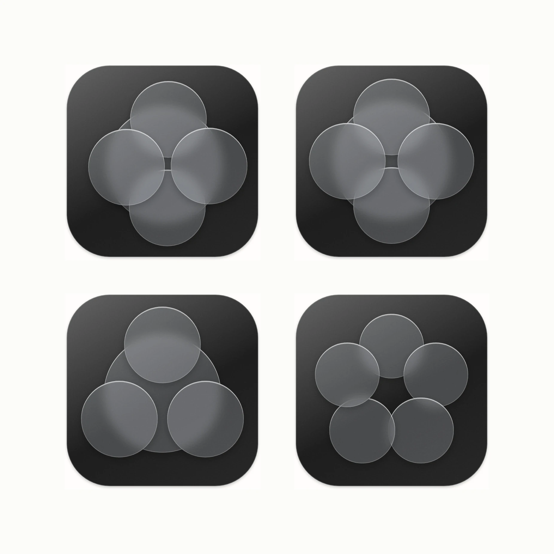
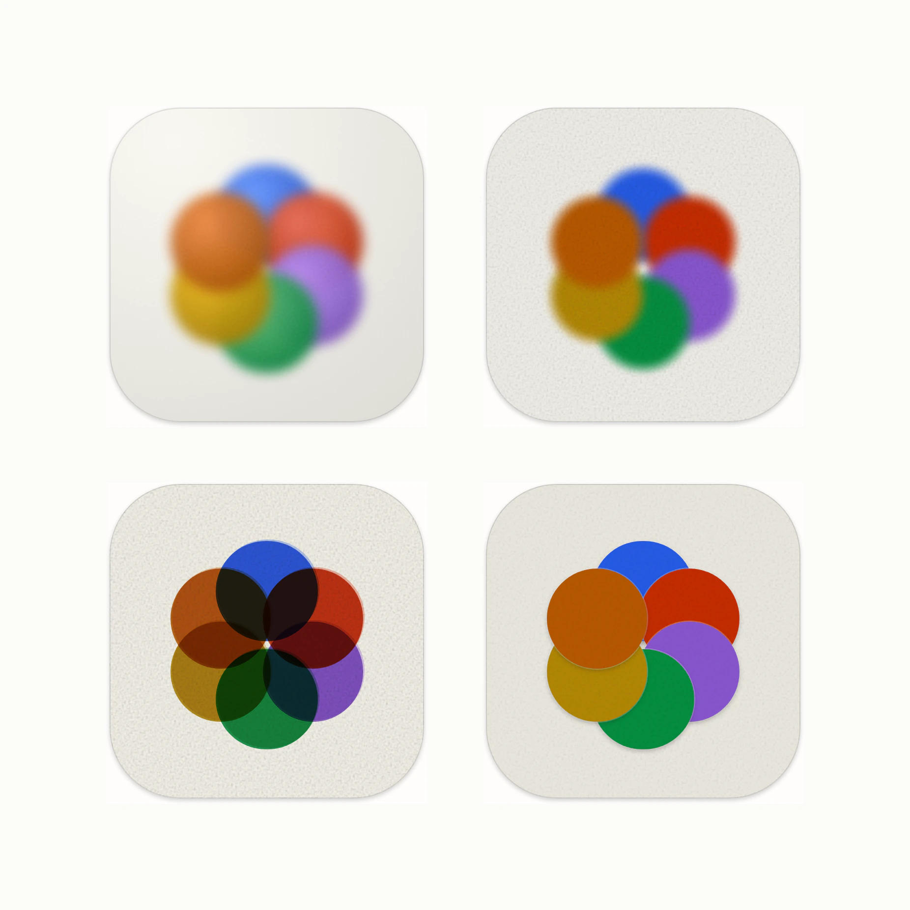
Circle icon studies of grey glass discs on dark tiles, in different arrangements.
Circle began as glass discs on ink.
Circle’s six coloured discs rendered with different textures, from soft grain to flat overlapping colour.
A sampler compared textures on the same discs.
Trove icon studies: the four-pointed sparkle alone, then struck into gold coins, solid and ringed.
Trove’s sparkle was recut as a coin, tried as a stamp, a strike and a rim.
The four app icons in their graded treatment on cream tiles, above the same four as glass on ink tiles.
Circle, Dispatch, Trove and Artefact share one graded treatment, with a glass version of each on ink for dark mode.

Texture and pattern

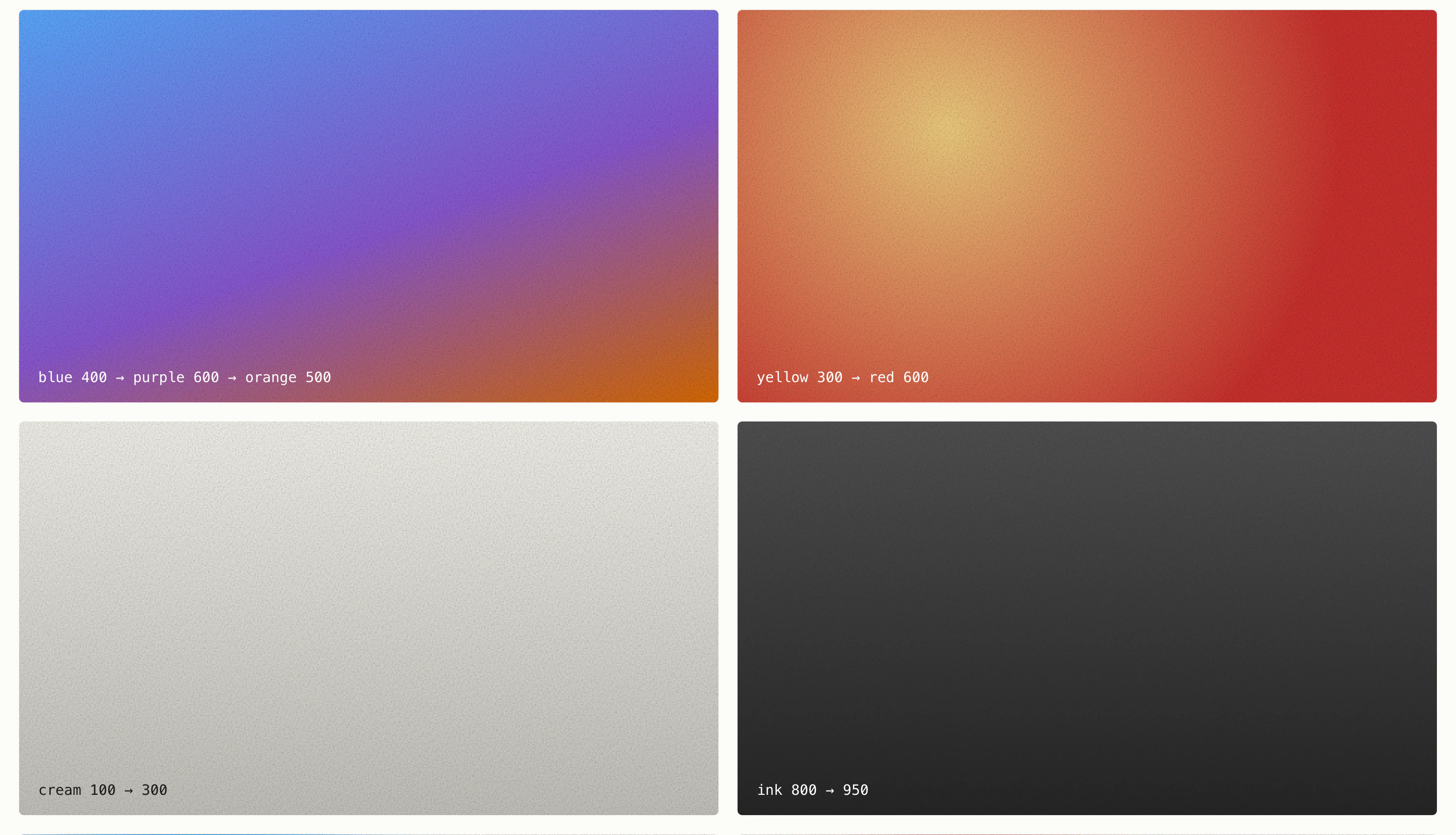
Grain stayed from the first studies. It sits over flat colour and in the fades of the icons.

The pattern on the homepage is built from a few pieces, each a single fade laid on a grid. The same pieces fill an empty space in the product, in place of content.
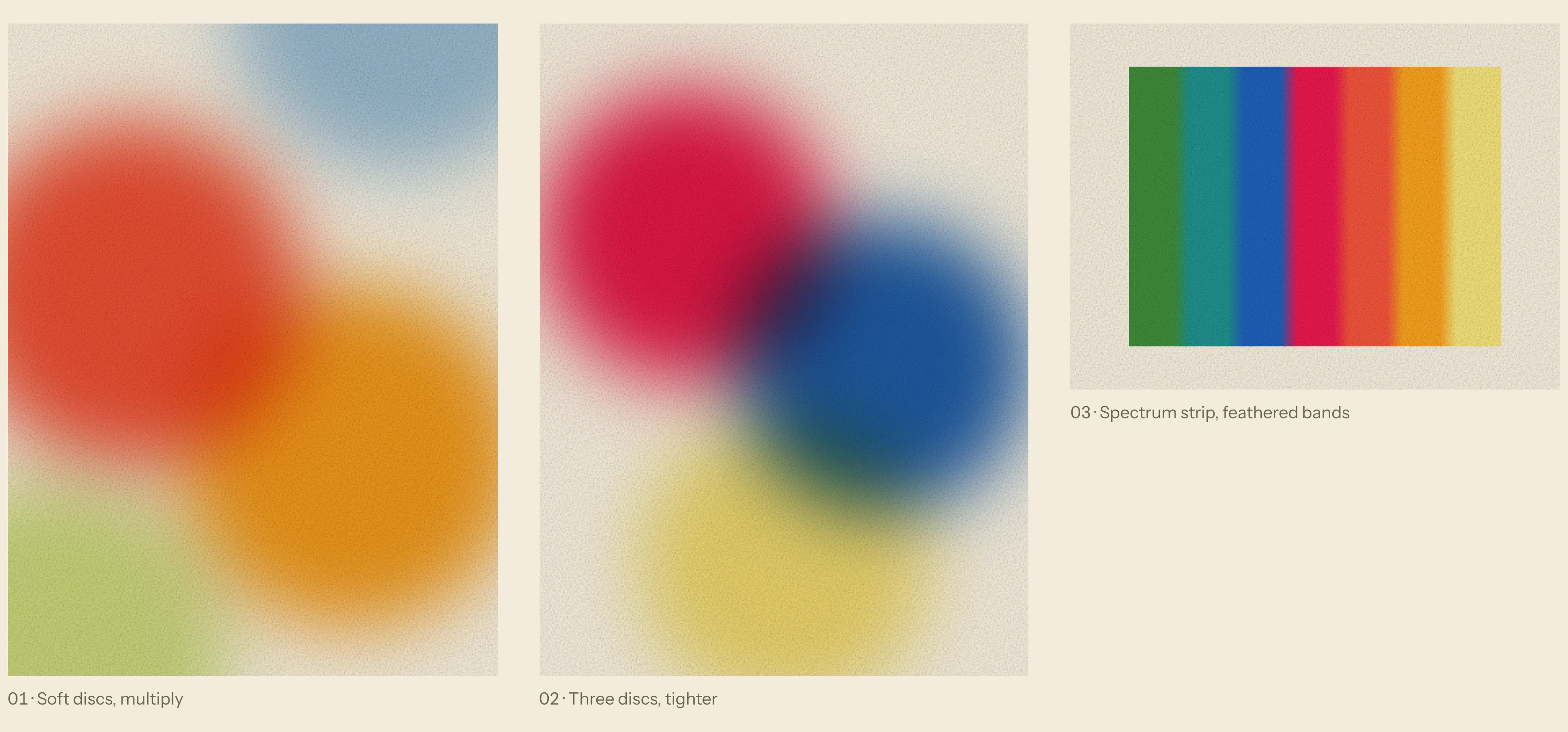
Blurred discs of red, orange, blue and yellow over grainy cream, beside a feathered spectrum strip.
Soft discs of colour and grain were among the first studies.
Large gradient panels with visible grain in blue, purple, orange and grey.
Grain was laid over every colour, flat and in gradient.
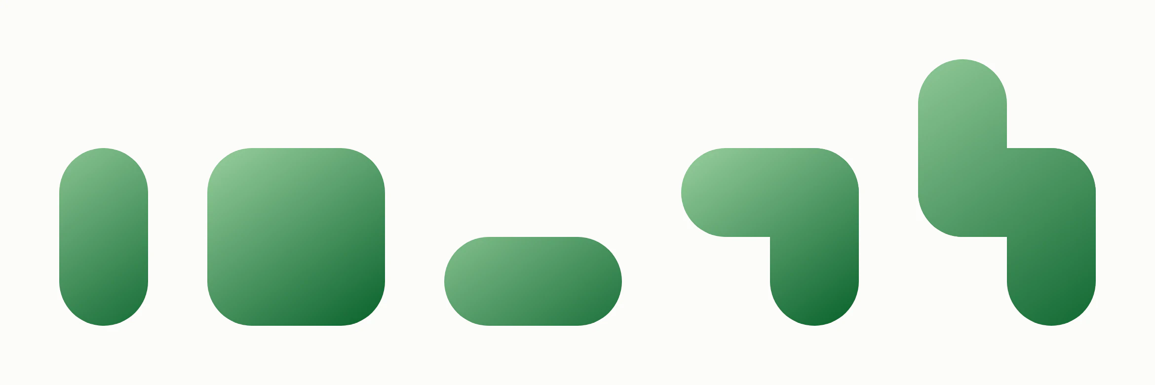
Green pattern pieces on their own: a capsule, a rounded square, a short bar, an elbow and an S.
The pattern is built from a few pieces, each with a single fade.
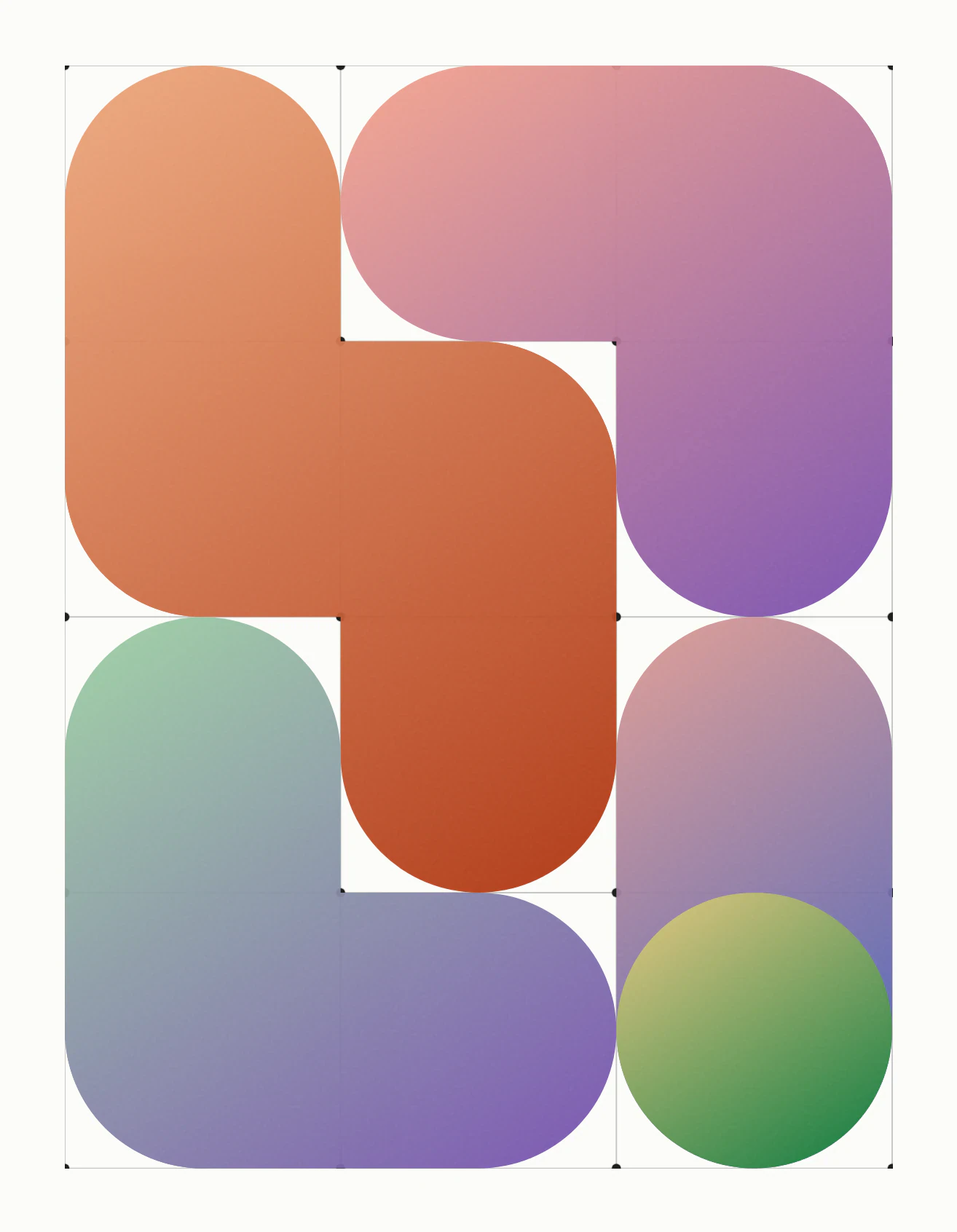
The homepage pattern: rounded orange, purple, green and blue pieces fitted into a block, each with a soft fade.
On the homepage the pieces lock together into one graded block.
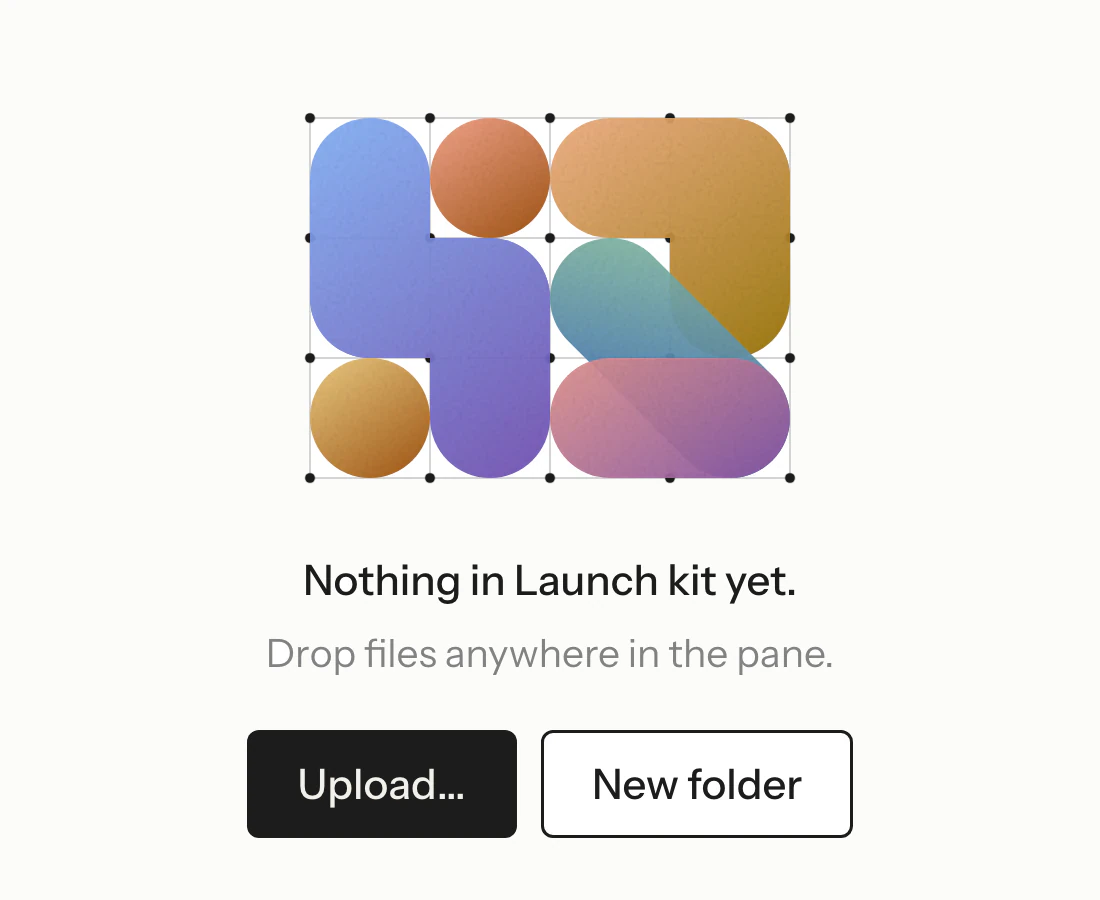
An empty Artefact space showing a small block of the coloured pattern above Upload and New folder buttons.
An empty space in Artefact shows the pattern in place of content.

Shipping it

The colour tokens were recast into Workroom in one release: every product moved onto the new surfaces, the new mark went onto the browser tab, and the marketing site went up with the pattern on its homepage.

The site’s dark mode followed, on a warm ground chosen over a neutral one and the brand’s ink.
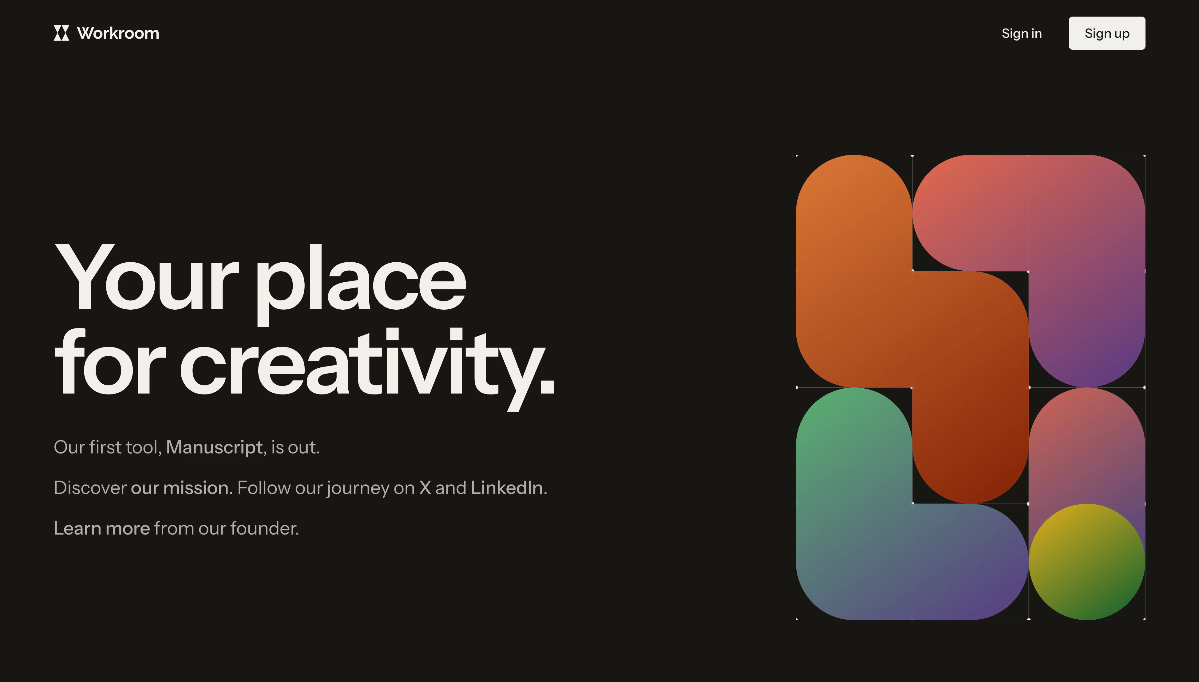
The live Workroom homepage in dark mode, with the headline “Your place for creativity.” beside the graded pattern on a warm dark ground.
The site’s dark mode sits on a warm ground.

Outcomes

A mark that reads at favicon size and carries the wordmark

Colour, type and surfaces settled as one system

One graded icon family across Workroom’s tools

Brand and product shipped together in one release

Each settled value kept once as a token and once in a spec
Project artifacts

Workroom brand page

Web wkrm.ai Visit

Workroom homepage

Web wkrm.ai Visit

Get started today.

Book a call