PJ
Loam Capital
- Jan – Nov 2026
- Product Therapy
- Build
Overview
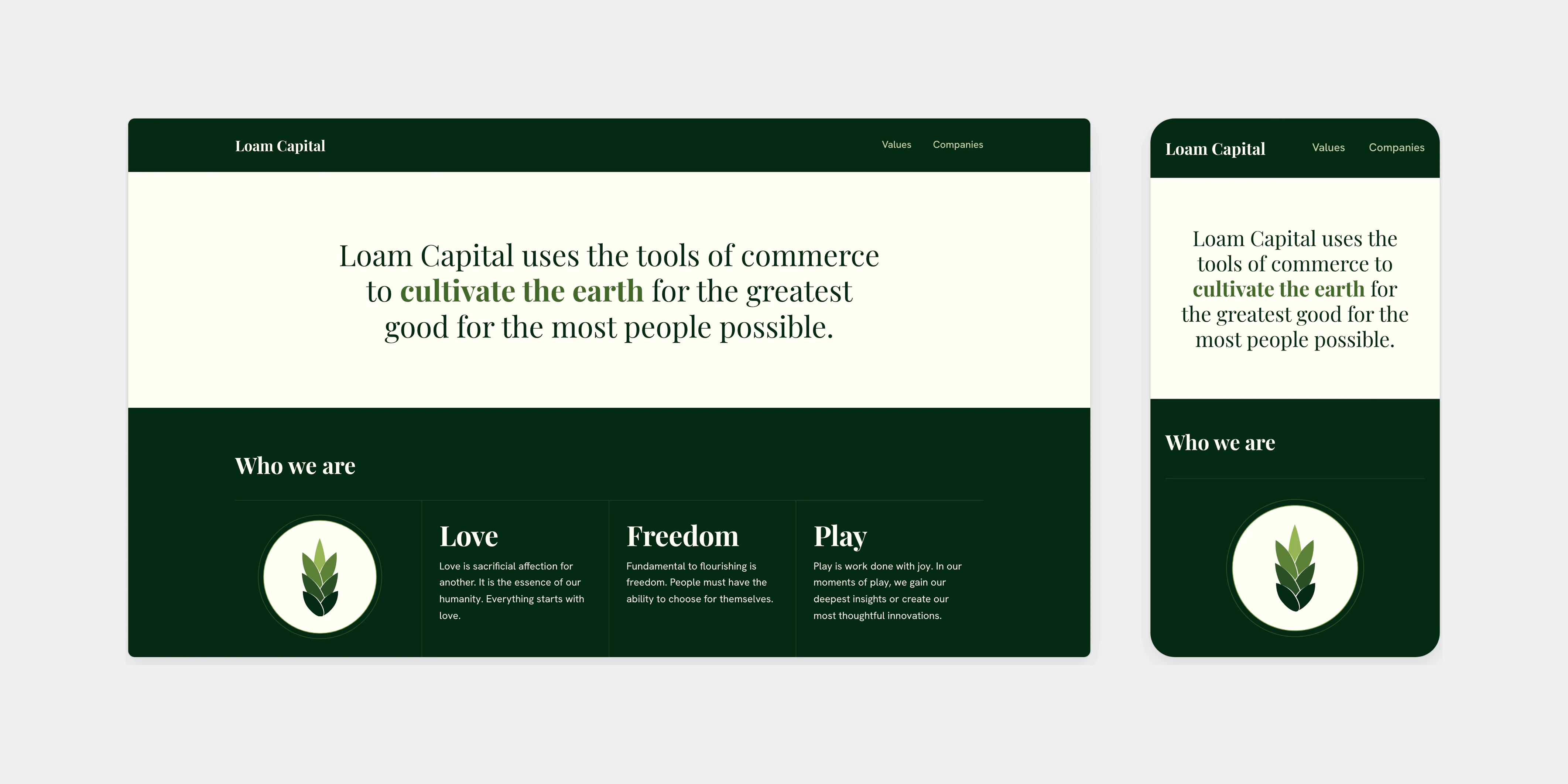
Loam Capital uses the tools of commerce to cultivate the earth for the greatest good for the most people possible. Its website sets out the values behind that mission in Loam Capital’s own words, and introduces its companies.
We took the identity from a brand board to a coded style guide and built a first site from it. The site that shipped started again from Loam Capital’s written values, and it lets those values carry the page.
- Timeline
- January – November 2026
- Scope
- Style guide, website and content model
- Tools
- Phoenix, LiveView and Brix
A style guide from the brand board
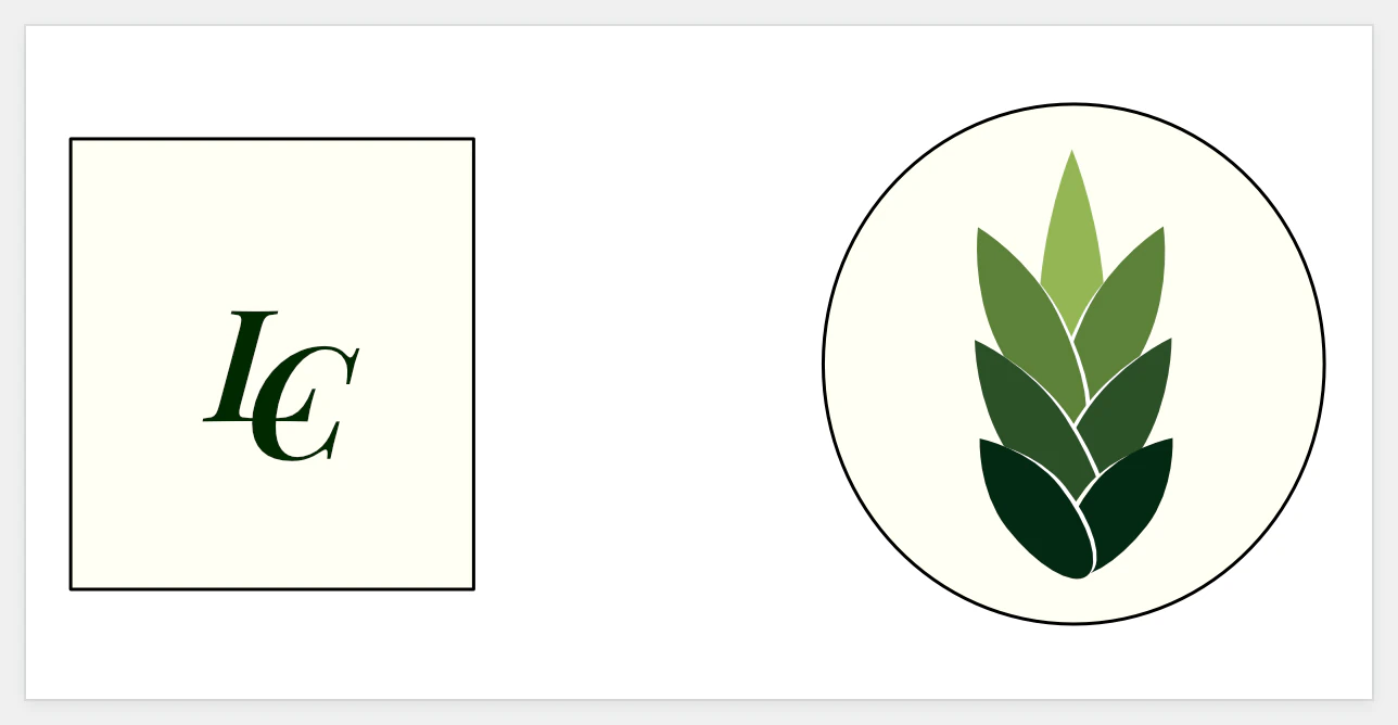
The work began from a brand board. It already held the sprout made of stacked leaves, the italic LC monogram, the wordmark in Playfair Display on a deep green bar, a ramp of greens and a cream ground.
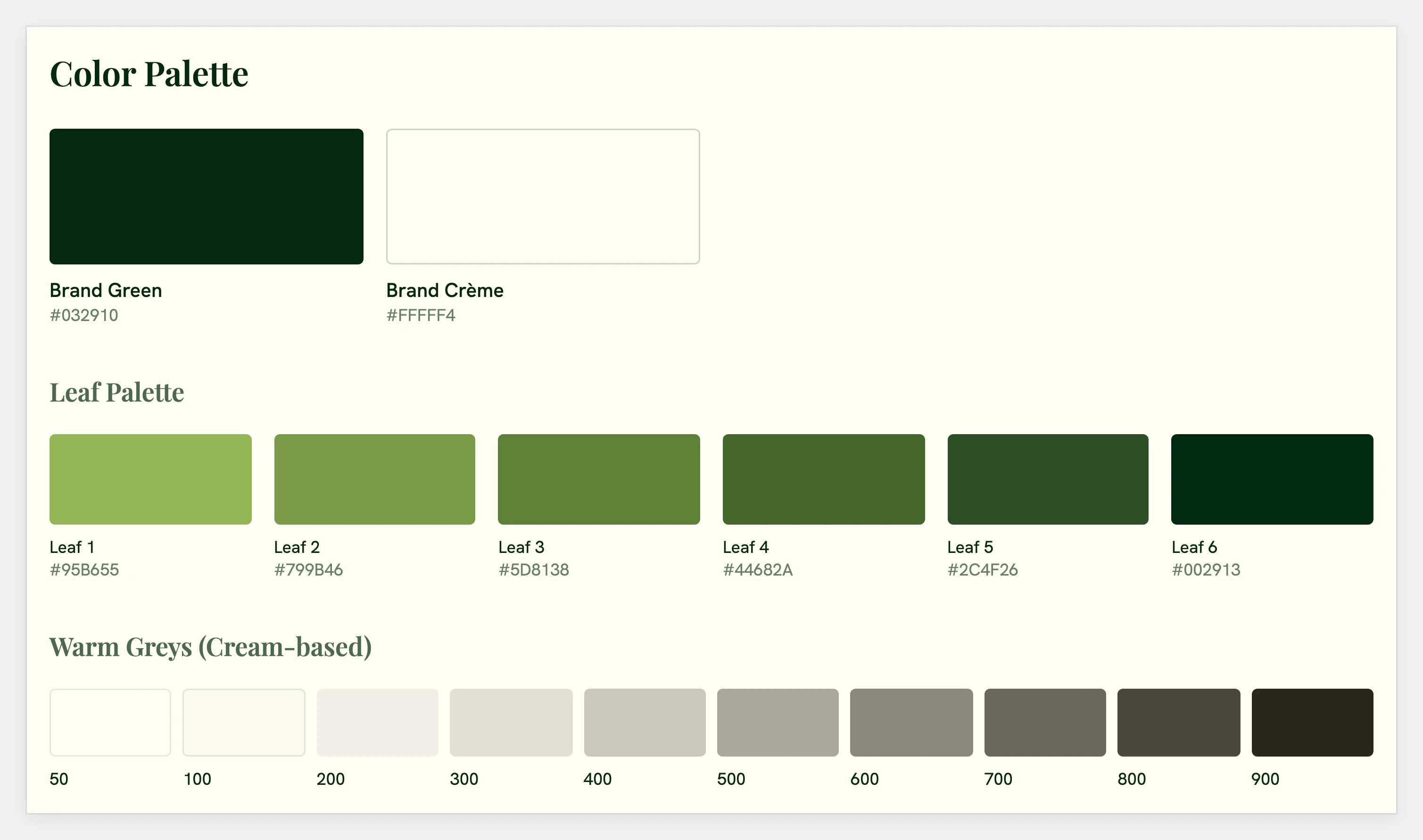
We turned the board into a coded style guide. Each green became a named token beside a warm grey scale drawn from the cream. Playfair Display was set for headlines and Hanken Grotesk for text, and lines and borders took the place of shadows.
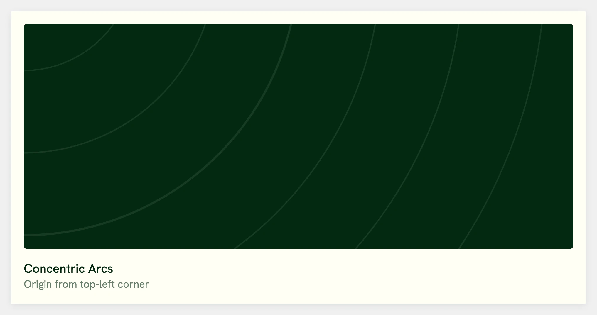
The guide also explored ornament: curve textures, corner flourishes and framed pull quotes. Little of it reached the site. What carried forward was the palette, the type pairing and a double rule.
The first site
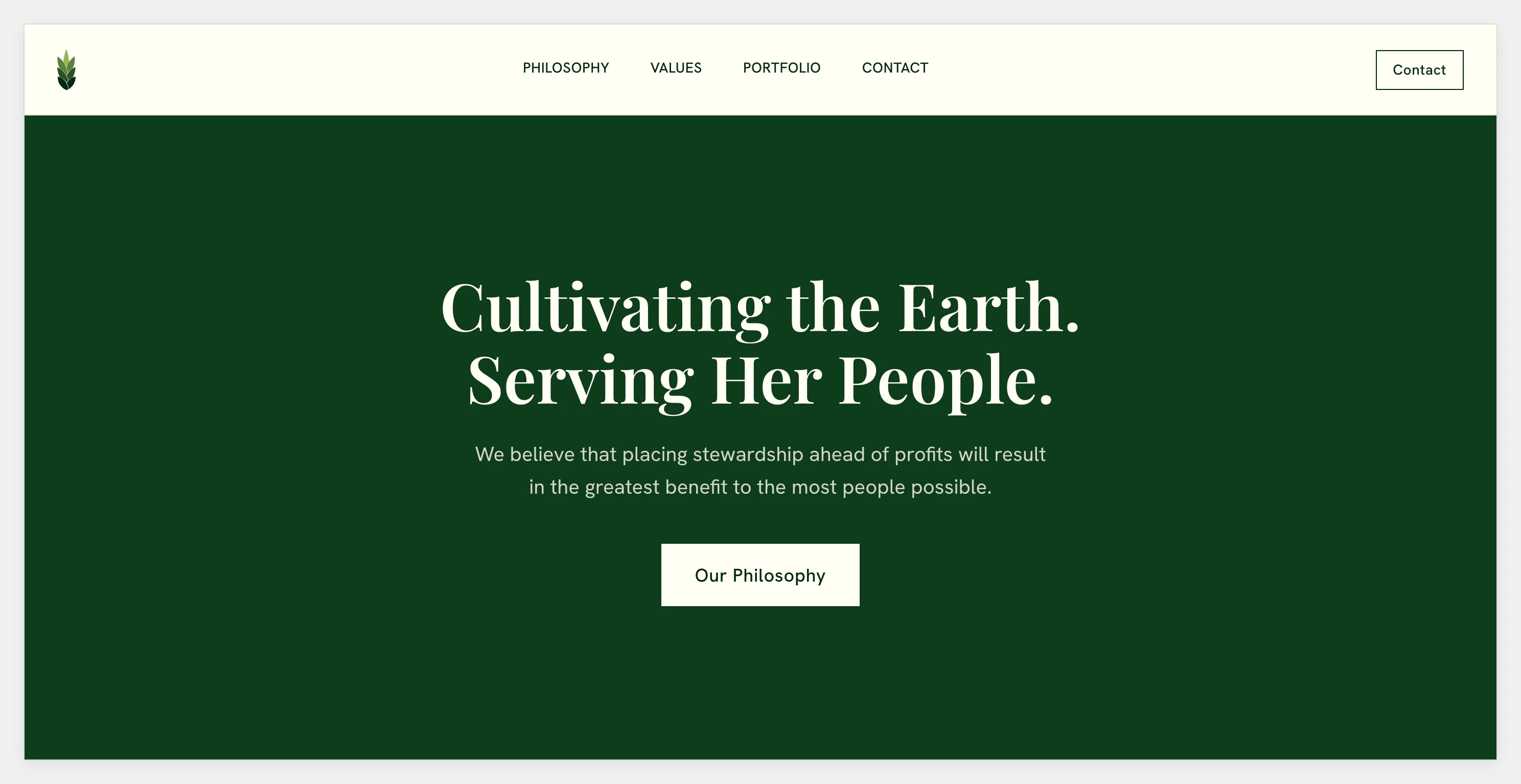
The first site carried the style guide’s mock-up into a working app. It kept the mock-up’s headings, sections and tokens.
To that it added an inquiry form and a list of projects.
Starting from the written values
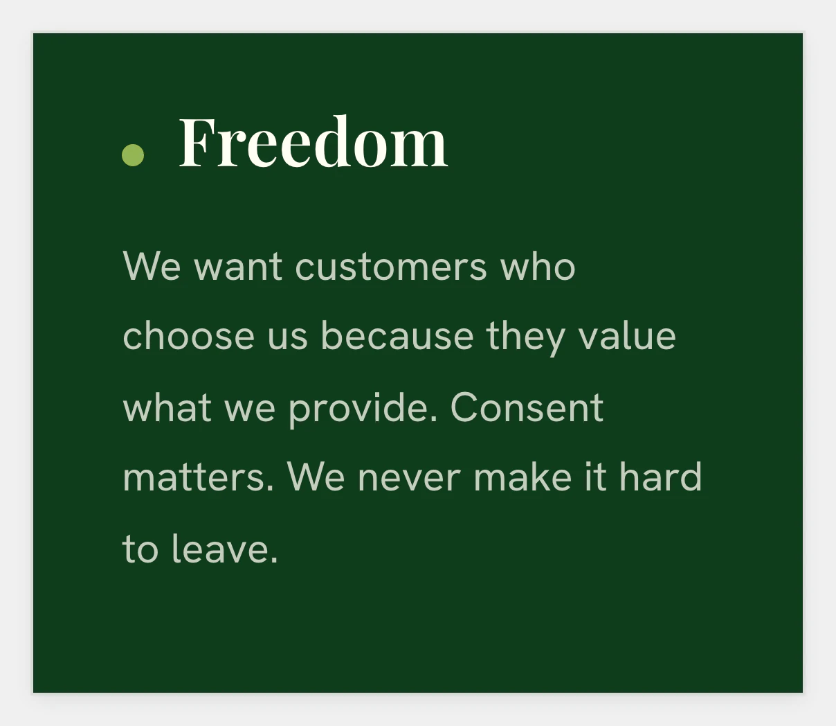
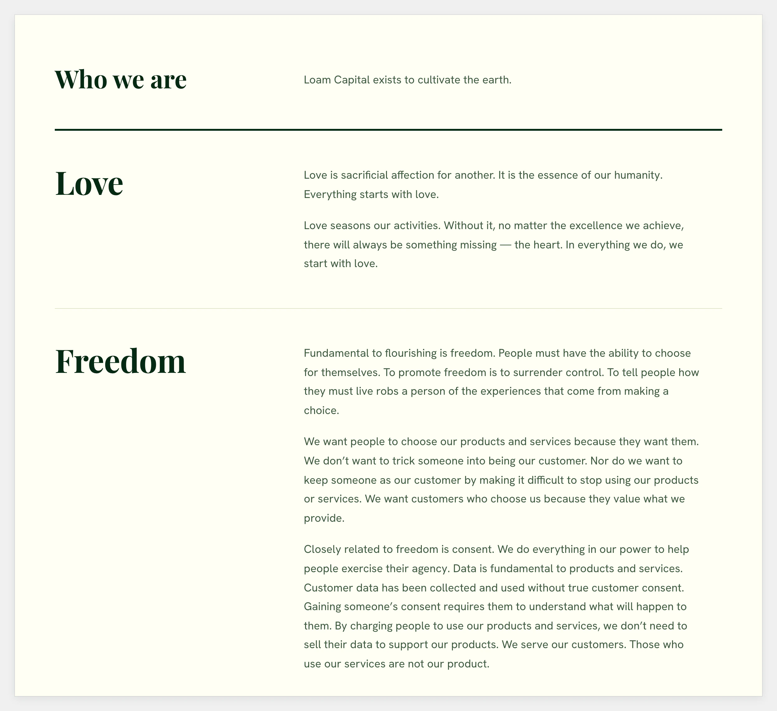
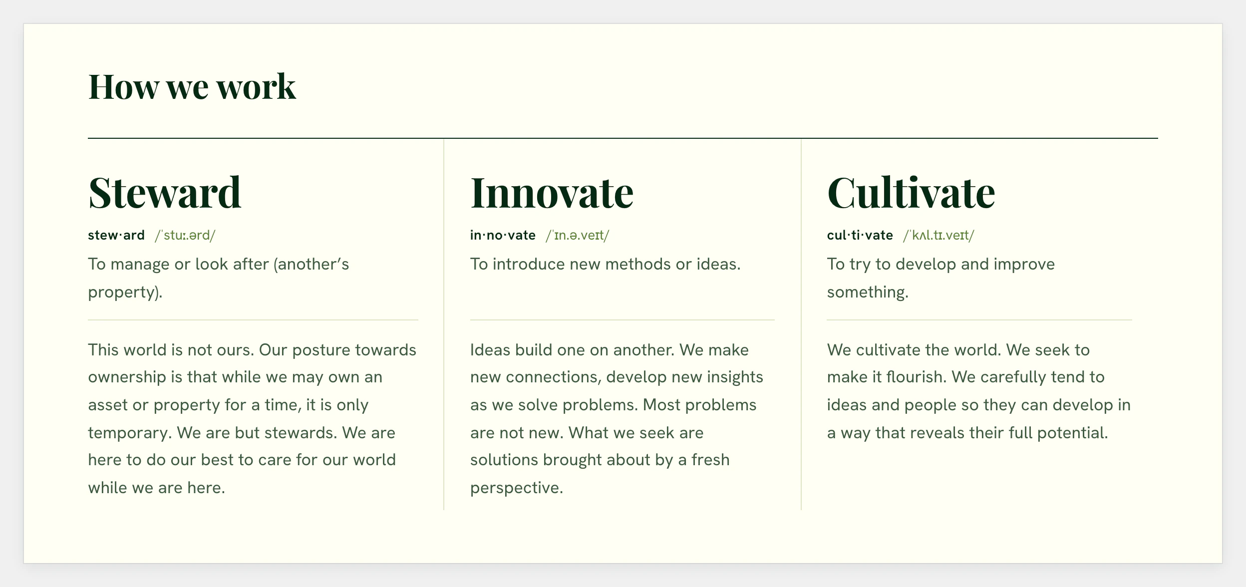
The site that shipped started again from Loam Capital’s own written values. The first site had summarised each value in its own words. The new rule was to trim the source text but never reword it.
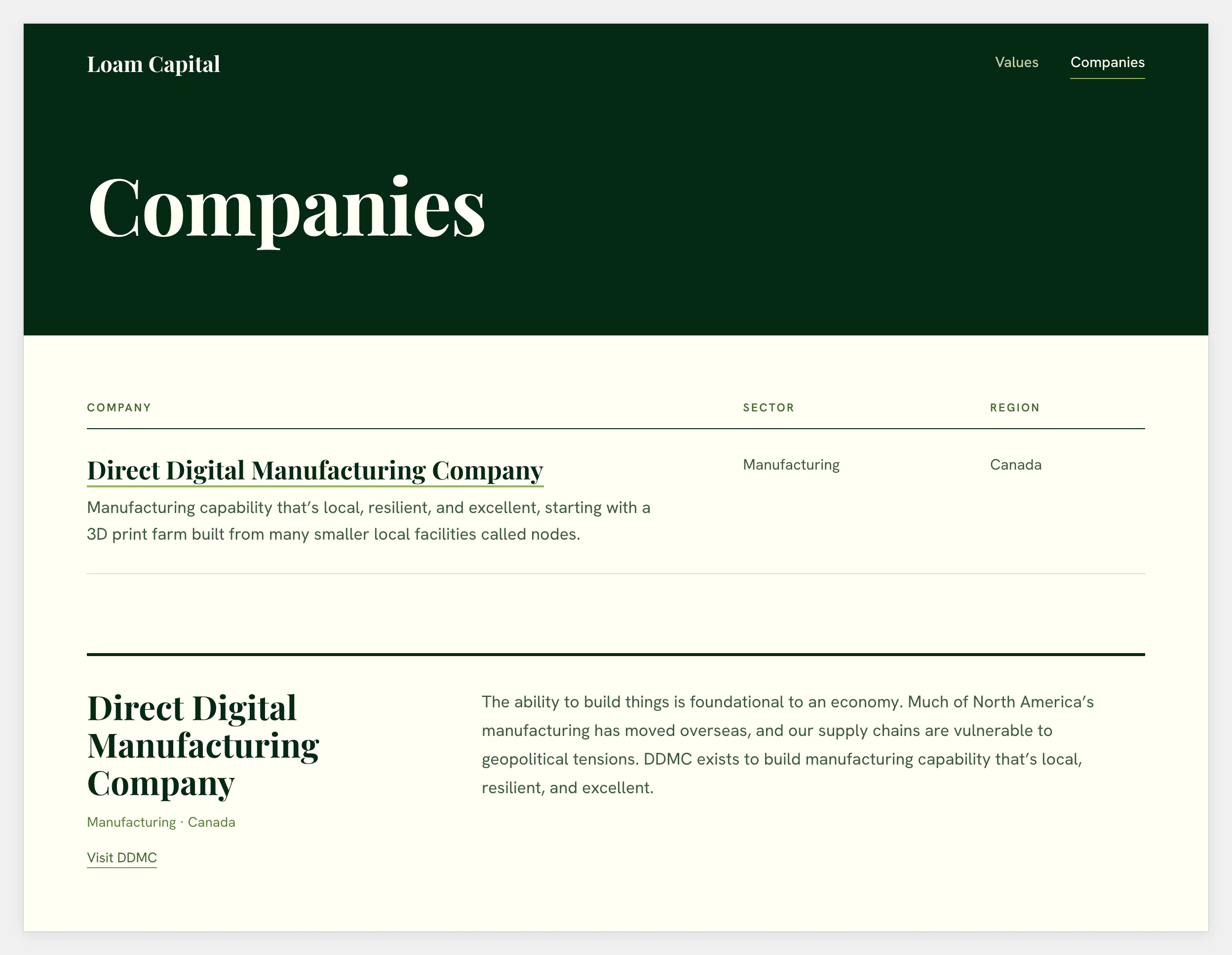
The list of projects became a list of the companies Loam Capital is ready to announce. The inquiry form became a plain address to write to, and the site carries no analytics.
A content model in plain files
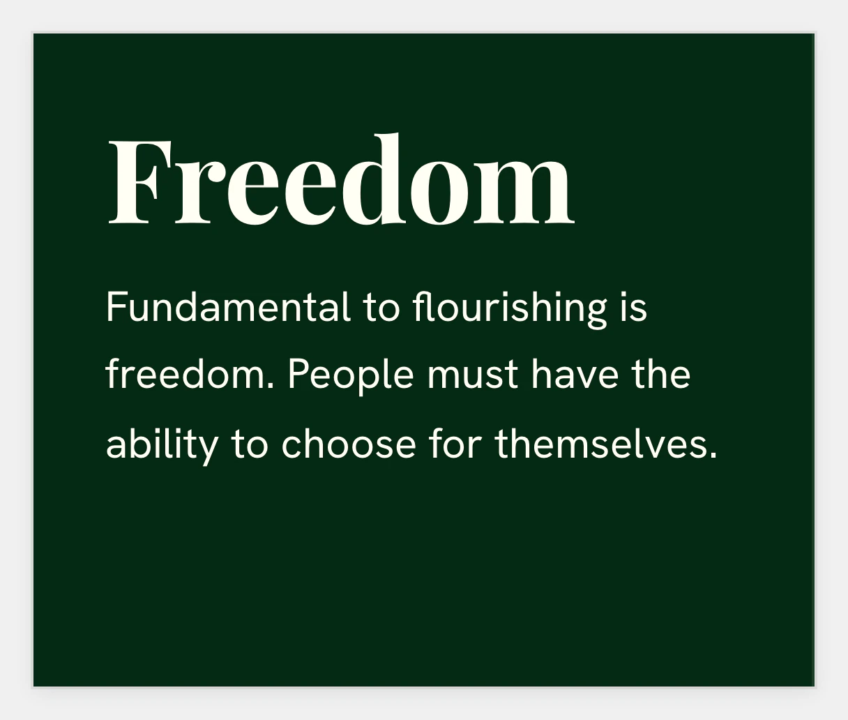
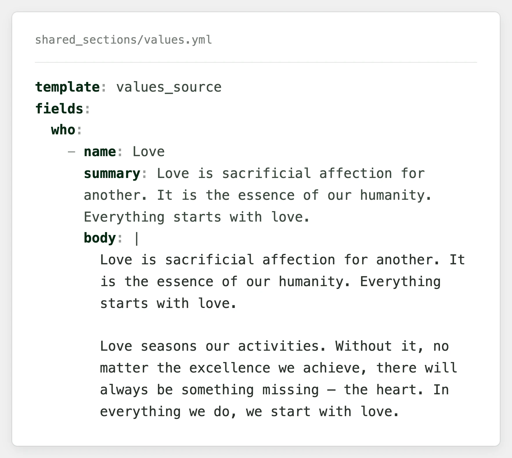
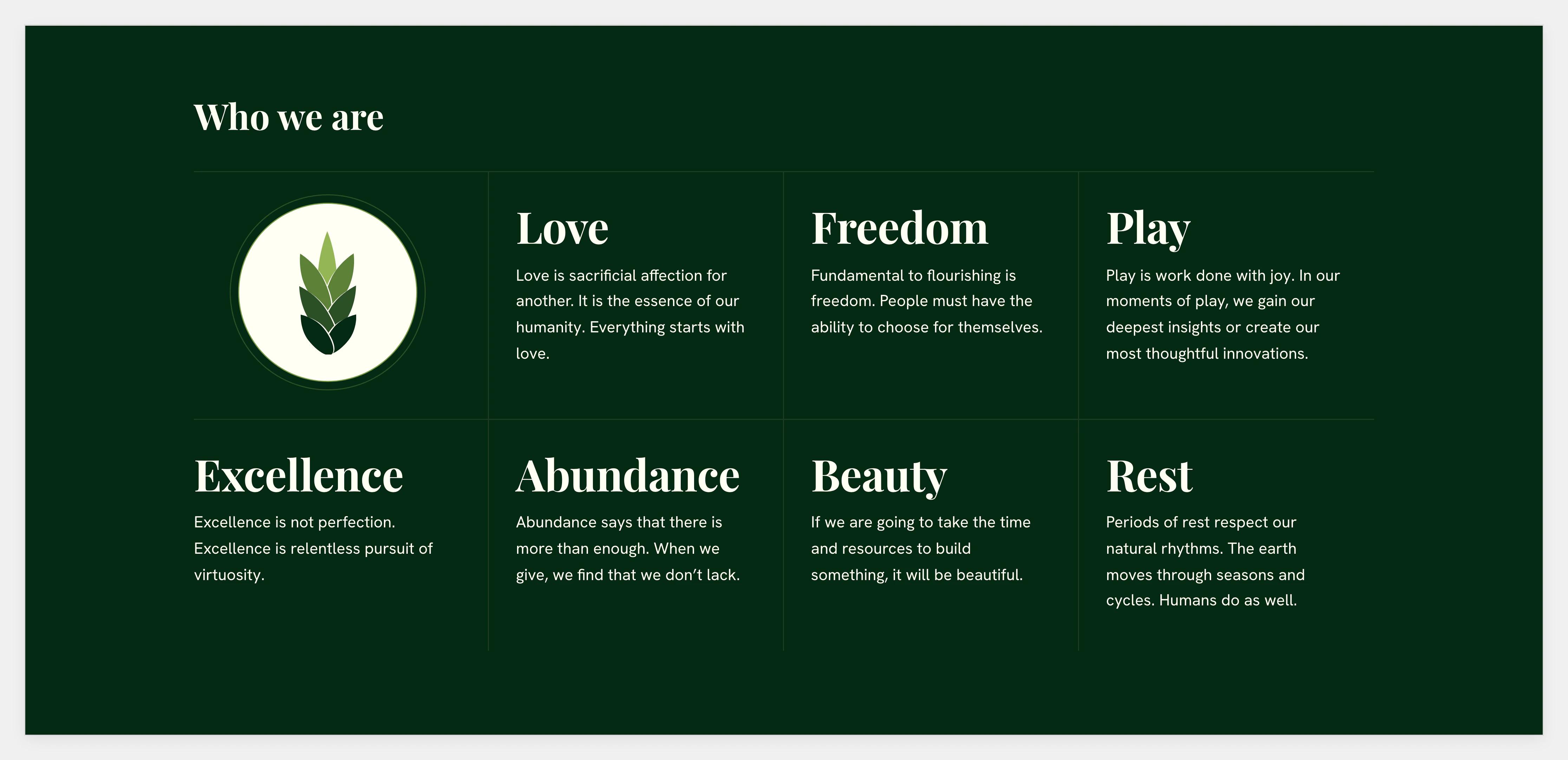
The site runs on Brix, our flat-file CMS. The values are written once, in one file. The home page shows a short form of each and the values page shows the whole text, so the two can’t drift apart.
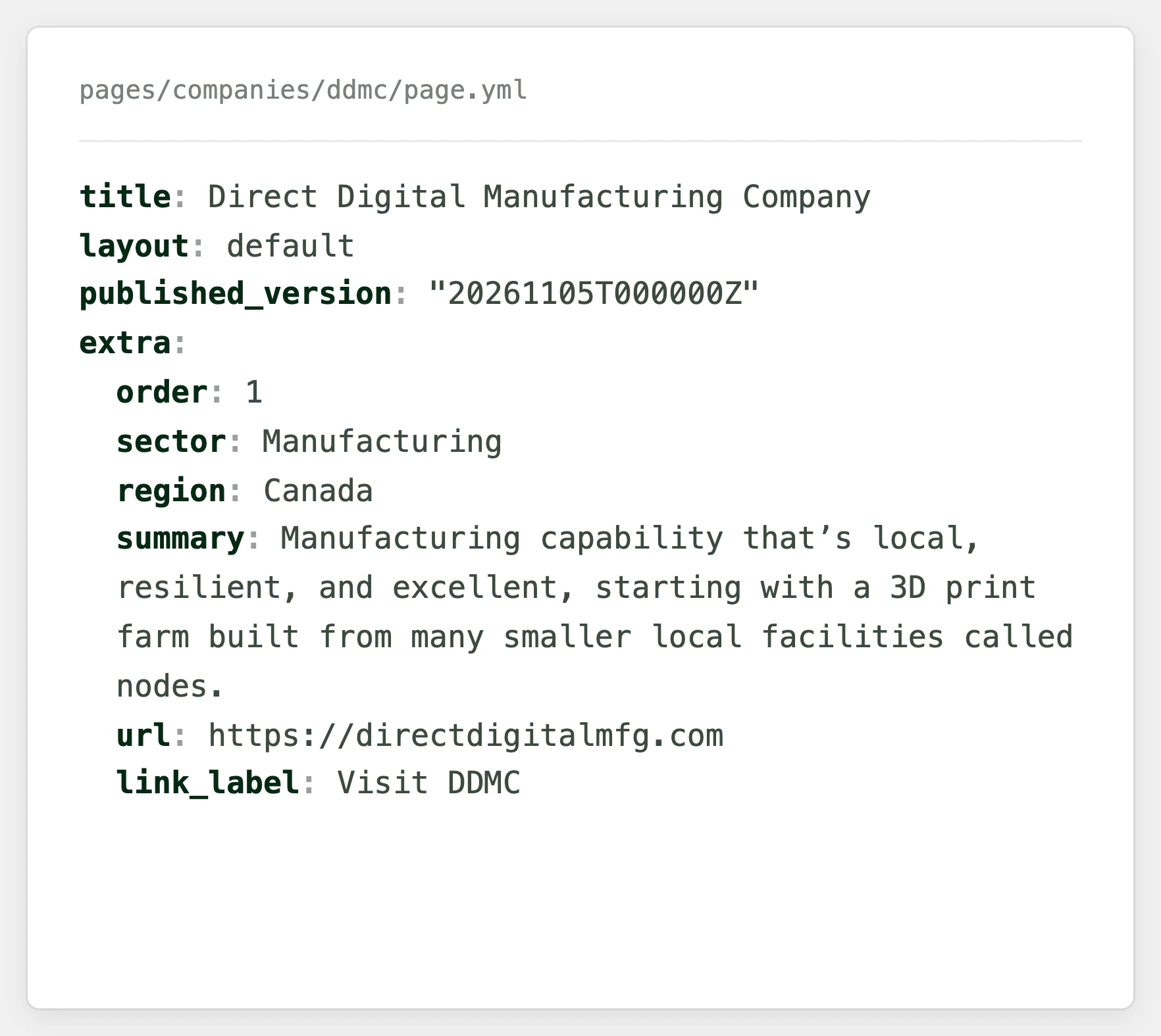
Each company is a folder of plain files that holds its sector, region, summary, link and profile. Adding a company means adding a folder, and a company can wait as a draft until it is ready to announce. Every page is drawn from section templates, so a change of content never touches the code.
Applying the brand
The site stays green. The darkest green from the board is both the ink and the dark ground, and a charcoal ink was tried and set aside. Playfair Display appears only at headline sizes. Everything else is set in Hanken Grotesk, and no text is set in italics.
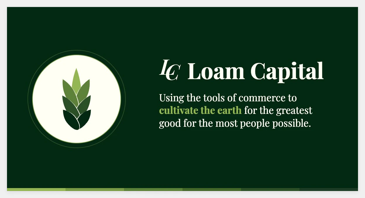
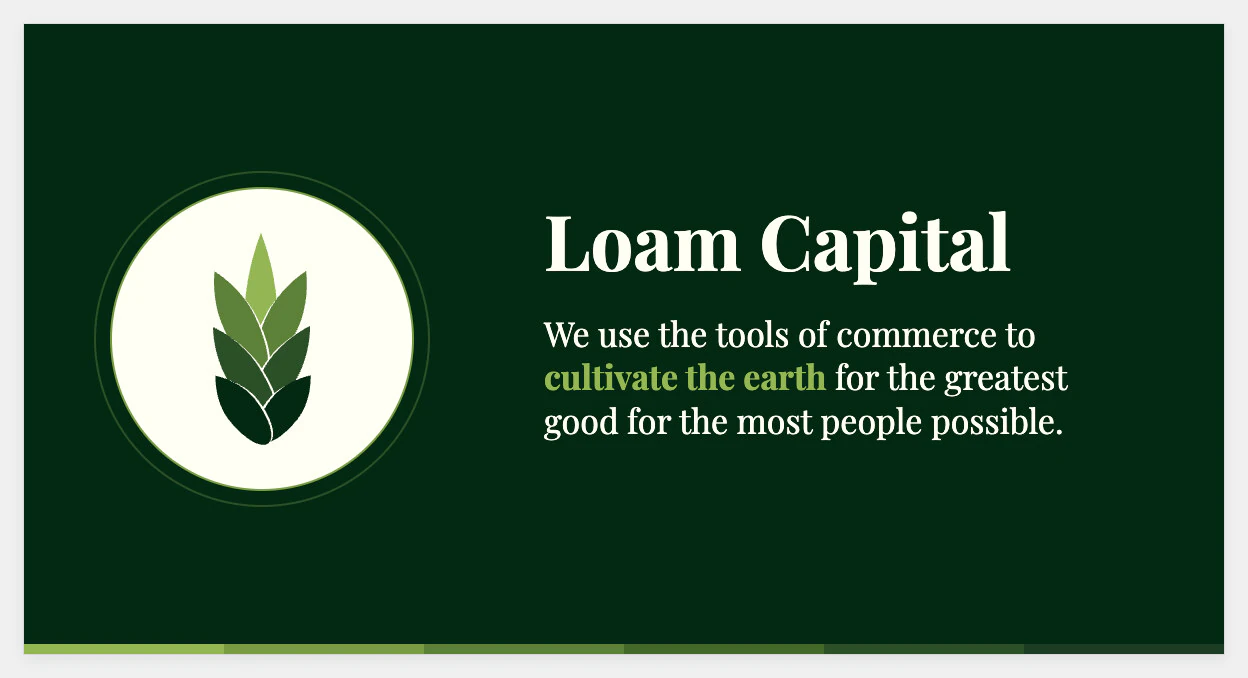
The sprout sits on a ringed cream medallion beside the values, as it did on the board. The header carries the wordmark alone and the footer carries the monogram alone. The share image was pared back until it held only the sprout, the name and the mission.
Readable by people and machines
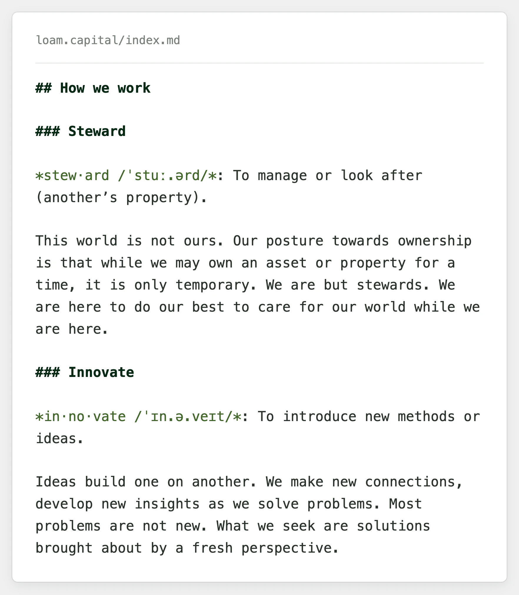
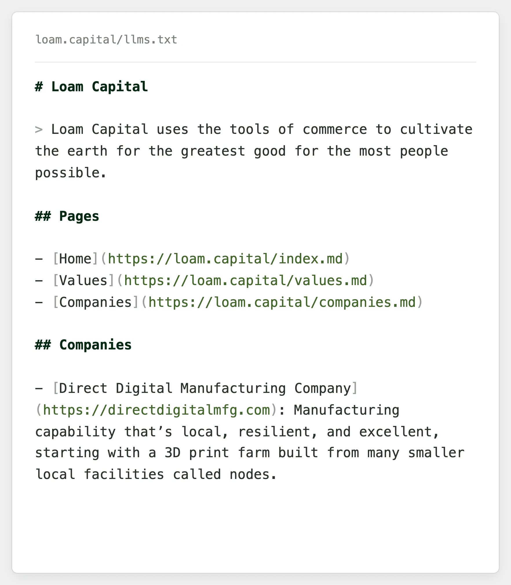
Every page has a plain Markdown version beside the designed one, and an index points language models at all of them. Search engines get canonical links, a sitemap and structured data that names each company.
The site is marked as Canadian English and links to Loam Capital’s profiles on LinkedIn and X.
Outcomes
A live website that states Loam Capital’s mission and values in its own words
Values written once and read the same everywhere they appear
Companies added and announced as content, with no code
A brand board turned into a working palette and type system
A site readable by search engines and language models, with no analytics
Project artifacts
Loam Capital website